Wednesday 23 November 2016

AVA Catch up: Fungus, Winter, Experimental work

The days get busier and busier, and although I am still painting regularly, I do not seem to find that extra time to keep the blog active. Sadly, I think it will get worse as Christmas approaches!
Anyway, just a very brief catch-up on what has been happening at Avon Valley Artists Group.
Three recent weeks subjects for you to look at.............not all successful, but hopefully interesting.


This is my response to the subject of 'Fungus' I found this interesting purple specimen in a book on the subject and really enjoyed playing with the texture of both the pods and the undergrowth. I especially enjoyed the latter, sticking all sorts of paper, threads and gesso to the paper before starting to paint.


This painting is my response to the subject  'Limited Palette'. We were allowed two tubes, pans or sticks of colour and I used Indigo and Quinachridone gold. There was a lot of masking fluid to start with, as I knew I would not be able to add hightlights with white.
 I did add more white when I got home and a bit of splatter to give a more wintery feel to the painting.


This is my take on our experimental week. We had to include newspaper in the work and there was some confusion about whether we had to cover all the ground with newspaper first, or just parts of it.
I went for a complete sheet which was possibly a mistake, and we could only use black and white and one other colour. I selected Brown Madder, but when starting the painting, I wished I had chosen a more yellow gold pigment. However, the Brown Madder does seem to take it into the surreal which is perhaps no bad thing for experimental work.
I am also disappointed that I covered nearly all the news print. I would have liked to have seen more of it in the finished piece, not just the texture that it created.


Hope you enjoy looking.


Saturday 8 October 2016

Blackberries

Back to some old favourites this week for my solution to my art group subject of  'Harvest'


The work is done on Hahnamuehle 'Cornwall' matt 450gm paper. I like this density as it avoids buckling whilst painting, especially if I am going to start with a fairly wet wash.


I started by wetting the top corner of the painting, and dropping in some Indigo and Bordeaux and allowing them to mix freely together. Whilst still very wet, I blew the paint with a straw to send 'twiggy' shapes diagonally across the paper.


When the background was dry, I did a light drawing of the composition, very vague just so that I knew where I might want the fruit. I could alter it as I went along if required. I did the drawing on top of the wash to enable me to erase it as I worked the painting.


The dark berries were painted with Indigo and Bordeaux, the green ones with a mixture of Serpentine Green and Yellow Ochre, with a hint of Quinachridone Coral in places, and the red ones with a mixture of Quinachridone Coral and Pyrrol Red.


The leaves were painted with Serpentine Green, Cadmium Yellow and Yellow Ochre.


The initial background wash gave me vague shapes in the background which I slightly enhanced and the twiggy bits were made into stems using various browns.


When the painting was displayed at the end of the session, I was encouraged to leave it totally alone as it seemed to have reached the point of completion. However, propping it up in the studio for a few hours made me realise that all the lower fruits were art the same level so I added 3 more blackberries and a leaf to the spray second from the left to take it slightly lower. I think this works better.


Hope you enjoy looking.


Wednesday 28 September 2016

L'Age Baston Holiday

After all the hard work with the exhibition in Wells Cathedral, I went on a much deserved painting holiday in La Charante region in France, at a chateau called L'Age Baston.
We all had a wonderful time in lovely surroundings, with great food and Jenny Johnson as our lovely tutor.
My aim was to just enjoy the pleasure of drawing and painting each day, and perhaps try to paint a landscape or two.....with Jenny's help, as this is totally unusual for me.


I managed some quite good sketch work and produced two proper paintings during the week. Strangely, they both ended up as square images, which again is so unlike me.


They were both painted on Arches paper, which was the only paper on offer, so another new experience.


By the end of the week, I was back painting flower subjects!!


Hope you enjoy looking.


Sunday 14 August 2016

Hydrangea


Having said that there would be no more painting before the exhibition, I was organised enough to be able to go to AVA group as usual and painted a picture with which I was quite pleased.


The hydrangea have been really lovely this year, perhaps because of the very damp spring. The various ones in my garden are very subtle shades of pink/purple/blue. They proved to good to resist and so whilst dog sitting a friends pet whilst they are away on holiday, I managed a second more abstract painting covering the initial wash with random dyed tiny squares of silk. I also used a little lilac pen and added some of the loose threads from the silk.
I tried not to overdo the collage part of the painting and kept some of the edges quite shadowy.


Two completely different ways of tackling the same subject. I hope you enjoy looking.


The top painting was done on Fabriano Artistico extra white rough 300g paper, and the second painting was done on Hahnemuhle AndalucĂ­a 500g rough paper

Friday 29 July 2016

Painting without drawing

I recently went to a demo by Soraya French and she said the too careful a drawing was very limiting to freedom. She suggested that if you spent ages on a complex drawing, when you came to paint it, you became too afraid to spoil all your efforts, that the process of painting became less spontaneous and hence less free.


I took up this idea and over the last few weeks at AVA I have tried to paint images with no drawing at all. It started with the Bluebell Wood in the previous post and over the next three weeks produced 3 more images with no drawing other than a couple of circles to place the flower heads in the right place. In the poppy painting, I did not even do this.
So all the paintings were straight in with a brush loaded with pigment, to see what I could do.


They are not totally successful, my visual memory is poor and there is very little room for error, but it was liberating, and I will certainly do more.


                                                                           Poppies


                                                                           Hollyhocks


                                                                                Alliums


This will be my last post for about 3-4 weeks as I now have two weeks of hard work getting over 90 paintings ready for my annual exhibition in Wells Cathedral and 2 weeks of being there to man it. I cannot be distracted by painting etc, so it will be quiet until the beginning of September.
Hope you like looking at the images.

Thursday 7 July 2016

Bluebell Wood

Just a quick post. I have been away for a short break and came back with the need to prep something for AVA the following day.
No time for detailed drawings so decided to go a bit abstract/creative.
Sorry there are no pictures of the process, but it is quite simple


I painted a wash onto a piece of Fabriano 300g paper and added a bit of sea salt to start off the texture thing!.
I then diluted some PVA glue and gently covered the paper being careful not to disturb the wash.
I took a piece of good quality tissue paper, crumpled it as tight as possible and then opened it up and gently pulled it to cover the pasted wash.
I then lightly rollered it with a bottle to remove too much air and to create small, shallow but crisp creases.
 I then simply painted my bluebell wood on top, keeping each layer of paint reasonably wet to allow it to run across the creases, but I dried it well before adding another wash on top. It was finally finished with a good splattering of white acrylic gouache as usual.


Apologies to any long-standing readers for repeating the process, but I wanted to quickly add something to the blog to keep it active. Hope you like the result.


                                   Mixed Media, Fabriano Artistico, Extra White 24 x 36cm
                                                                     Bluebell Wood


Tuesday 7 June 2016

Rhododendrons in Sunlight

Continuing on the theme of trying to capture sunlight on petals, I thought I might have a go at this beautiful white Rhododendron that has just finished flowering in the garden. Needless to say, it was beautiful until we had a storm and very heavy rain and I am afraid it did not recover well. Thank goodness I did the photos before that happened!


I am not going to say a lot about the process, as I think the photos speak for themselves. I did the drawing on rough Fabriano Artistico extra white paper and used mainly Cobalt Blue and Alizarine Crimson for the flowers.
I started with a detailed drawing, but have to admit to losing my way with all the trumpet shapes, so quite a bit was 'made up'!


My apologies for the quality of the next 3 photos, but they were taken during the art session at AVA and I cannot work out what was reflecting so badly across the paper. I have tried to remove some of the violet haze, but I am not very computer savvy, so they are not brilliant. At this stage the background was all white. I did not do any preliminary washes before starting the flowers.
 I spent a lot of time thinking about the actual colour of the flowers. So little was really white, but I needed lots of white paper to give the bleached out areas where the sun caught them.


At this stage I started to add some leaves as this gave me the negative shapes of the flowers and helped me to keep track of where I was going. Even at this stage I was not sure if the shadow areas were strong and dark enough for the effect that I wanted. But it is really difficult to add overdark washes which you hope will dry paler, especially with very staining pigments. I can over paint more darks if I decide it need it.


I then stared filling in the background washes. Dark in the middle but much lighter around the edges as I did not want the painting to become too heavy (Remembering what happened with the Fatsia leaves!) For these areas I used pale washes of blues, yellows and blue/greys with a little QuinachridoneGold. I also used this colour with Burnt Umber for the stems.


I finished by adding more leaves around the painting, leaving small patches of sunlight.


The painting looks quite bright on the screen, but by comparison to the previous Clematis painting, it does lack a bit of contrast, so as usual, I will live with it in the studio for a few days to see if I need to darken some of the shadows.

Sunday 29 May 2016

Sunlit Clematis

In my search for the best way to paint strong sunlight and shadows, I searched my stock of photos and found this lovely photo of some lilac /pink clematis from my garden last summer.
I thought it an ideal subject to have another go.


I have painted Clematis lots of times and been pleased with the results, but this time I wanted to capture the burnt out effect of the strong sunlight and the dark shadows created by this sunlight,

I did a very careful drawing and added a 3rd flower bottom centre behind the other main flowers to hopefully give a more interesting composition'
I painted the flowers first using only two pigments....quinachridone magenta and ultramarine violet.

I was quite careful to follow the darks and lights from the original photo as I wanted it to 'read' correctly when it was finished.

I will admit to finding it difficult to add the dark shadows, so afraid of spoiling it at this stage, as the flowers had taken some time to paint.  I also dreaded doing the background as the source photo was too dark and I did not want to make the same mistake that I had made with the Fatsia leaves (previous post ).
I am not sure if the leaves are dark enough even now, but I will live with it in the studio for a while and then darken any areas if I think it will help'


I am not sure either, if the shadows on the flowers are 'blue' enough but I think it is a step forward and I will keep on returning to this subject for now and see if I can really master it. There are some lovely roses out in the garden now so maybe they will be next.


Monday 23 May 2016

Sunlight Again : Fatsia and Lilies

Since I painted the 'Blue Cactus' which I thought was quite successful ( See post 22nd March), I have been very taken with trying to capture sunlight on plant surfaces......with more and less success.
However, as usual, it has been fun trying, and I will certainly keep having a go from time to time.

I started with a couple of photos I took in the garden of a splendid Fatsia bush. As the leaves are very glossy, the strong sun gives lovely lights and darks which I thought might be good to try. It also nicely fitted that week's topic at Avon Valley Artists Group which was 'Mostly Greens'


I started with a reasonably accurate drawing as the subject was quite complex and it is important that the finished painting 'reads' right. I started in the centre of the painting so that I could work on both leaves and backgrounds at the same time. I tried to keep in mind the idea that strong sunlight always creates strong shadows. I left parts of the leaves unpainted to give the bleached out areas and tried to set them against darks in the background.


At this stage, I thought it was going quite well, and continued in this way until the leaves were complete.


Now all that was required were the background shadows. This proved much more difficult. I used lots of Indigo, Apatite Green and Quinachridone Gold and added scratched in twiggy bits to give some sense of where the plant was growing.


I am disappointed that the finished painting looks heavy and somewhat uninteresting. In hindsight, I think I should have introduced some colour, maybe like the open tulips in the corner of the original photo. Trying new things is always a challenge, so I looked for something else.
I came across the photo below of some startlingly pink Lilies that I had been given as having some painting potential! I have avoided it until now as an impossible task!

 
I approached the subject in exactly the same way as the Fatsia leaves; reasonably complex drawing and petals first. The only difference was that the paper was treated with a wash and cling film prior to the drawing as I thought this might help guide the background when I came to that part.
 

The flowers seemed to be going ok and I tried to remember that I had thought the same with the leaves at this stage, so I was extra careful about attempting the background as I had put quite a lot of time into the flowers and did not want to mess it up. I left the half finished painting up in the studio for a while and gave the background some thought.


I decided that I needed to keep the background lighter, even though there needed to be some really dark areas in it. As I was painting, I kept lots of small sunlit areas between the dark leaves and twiggy bits and I think it worked much better. In fact I am really pleased with the result and am looking forward to finding something else to try.
My thanks to Pete Weekes for the photo and for believing that I could paint such a beautiful clump of flowers. I hope he is not disappointed.

Both paintings were done on 'Andalucia'  500 gm rough paper from Hahnemuhle with my usual palette of paints

Tuesday 3 May 2016

Burgandy poppies

As we move into May, it is becoming increasingly important that I accumulate some new paintings for the exhibition in Wells Cathedral. I owe it to them to try to produce my best possible work to create an interesting and varied display.
I dug out a resource photo of some stately 'Patty's Plum' poppies and a piece of 'Andalucia' paper from Hahnemuhle. It is a 500g rough paper, which does not readily buckle with lots of washes, and hopefully, once the painting is mounted and framed, it should not buckle within the frame. This will hopefully prevent last years problems when it was so damp and cold in the Cathedral. Several of the paintings buckled badly over the course of the 10 days

As usual with this sort of painting, I started with a reasonably detailed drawing of the flowers and leaves.

I painted each flowers with combinations of Quinachridone Magenta, Moonglow, Bordeaux and Anthraquinachridone Blue.

I have been trying to improve the contrasts of light within my paintings, so have been very careful about leaving white paper showing and creating darks as a contrast. As usual, I painted up to the pencil line and then erased it when dry. White top edges would be created by the background colour later in the painting if necessary.
As I went along, I included stems and a few leaves as this helped to see if the composition was going to be ok.
The flowers did seem a bit tightly painted, so I deliberately only half painted the tallest and the far right heads, to try to loosen up the picture.


Once all the flowers were complete, I painted in the leaves, using a variety of pale green washes, again leaving white tips to hopefully suggest sunlight, and darkened the undergrowth with Apatite Green Genuine

      When all the background was complete, I darkened one side of the stems and put in a few shadows and deepened the darks at the base of the poppy petals.
The photos look a bit pink, but the actual painting is a tad more burgundy than appears.
When all was complete, I made sure there were no pencil lines remaining, and it is now ready for mounting and framing.                                            


Friday 8 April 2016

Apricot Iris


I started painting this Iris with the intention of making it dark purple on an even darker background.
I started with a very careful drawing and began the painting with the background.
I was really disappointed and thought that the whole concept would not work, and so abandoned the project.
Hence no photos of the process......Sorry!

However, the drawing was complex and had taken for ever to do, so I thought I would try to at least produce something for the 'Bargain Browser' at my exhibition in August. It would save wasting the paper and might even make a bob or two!!

I changed the colour of the Iris, kept lots of white for the highlights and persevered to the end.

What a surprise, I am quite pleased with the finished result and I think it is worthy of a frame, which is good as I have a number of exhibitions this spring and am conscious that I still need the best part of 60-70 framed paintings for the Cathedral.

Hope you all enjoy looking.

As an update to the intellectual copyright of my painting and the embroidery kits, I have received a number of e mails about how the images came about on the wall in Cologne and how the catalogue was produced (Not sure how much of it I really believe!) and they offered to buy the copyright for three years, without any offer of compensation for their mistakes. The sum they offered was really paltry and I have refused, and told them in no uncertain terms that my work is never to be used for anything within their company in future.
I am awaiting their reply.

Any further news, and I will keep the post up dated

Tuesday 22 March 2016

A lesson for us all

Not my usual upbeat post today............I have been very upset and angry to find that I have been the subject of commercial theft.
I am writing about it on my blog site so that anyone who posts images on the internet can be aware of what can happen.

I had a lovely e mail from a student of embroidery to ask permission to use a couple of my paintings for projects within her course during which she was studying how to transpose paintings into embroidery projects. As an educationalist, I was happy to oblige, but pointed out that this could only happen whilst she was studying, and any work beyond that had to be approved by me and a fee payable.

This week I had a e mail from her to say that she had just started doing the drawing for her first piece when she found that a Russian company called RTO had already included it in their latest catalogue as a cross stitch kit. She was e mailing me to ask if there were any other paintings on which I had sold copyright, so that she could avoid using them.

I replied that I had certainly not sold any copyright to this company and in effect, they had stolen my painting and were using it commercially. It is a large company with a substantial catalogue so I presume that it is highly profitable.

This is my painting. You may well recognise it as it has appeared in one of my posts. I accept that by putting work on my posts and on my web site and talking as I do about the processes I use, other amateur artists will be encouraged to have a go.....its one of the ways we all learn. But they are not there for commercial gain.

This young lady then got in touch to tell me that there had been a recent trade exhibition in Cologne and this company had mounted a display of their forthcoming projects and on the wall in their display area was.........can you guess


As I am sure you can imagine I was incandescent with anger, at how a large and presumably prestigious company could stoop to commercial theft.
It has been difficult to do anything as everything to do with the company on the internet is in Russian so very difficult to understand, but I did manage to get the various links so that I could see my work in the catalogue and obtain the company address etc.
My young lady has sent me the links to their previous catalogues so that I was able to check that nothing else of mine has been used.

I have written  an e mail to the company stating very forcefully my thoughts on the matter and threatening them with international law, and asking for a substantial copyright fee.

I have no idea if I will hear back from them, or what my next step might be.
I suspect that they never thought that they would be caught, and it is the merest chance that I have found out about this, and I am so grateful to the young lady.

I will keep you all in touch with any progress, but please, where ever you are, if you see the catalogue or any of their products for sale, PLEASE do not purchase my design as they have no right to be selling it. And if you can spare the time let me know where you saw the embroidery kits.

On a much lighter note, the last two weeks at AVA group have produced 2 completely different paintings which I hope you enjoy seeing.

This painting was my response to the subject of Water. Totally outside of my comfort zone!


'Golden Carp'
 
Secondly, this week my response to 'Sunlight and Shadows'. Much more my kind of thing!

                                                                  
                                                                       'Blue Cactus'

Tuesday 15 March 2016

Blackberries Again

Two weeks ago at Avon Valley Artists, the subject was Fruit and/or Vegetables. I prepared a sheet of paper and found a photo of a branch of blackberries, as this subject had proved very popular at the previous 2 exhibitions in Wells Cathedral.
Unfortunately I was unable to attend the session, but took the paper and paints with me to my alternative venue and was able to execute the subject.

I wanted to use both ways of painting the background....both before the subject and after it.......and was able to do this as the background and subject were planned to be very similar in colour to each other. There would, therefore be no conflict of painting one colour on top of another. So I could do the wash first, paint the fruit and then add the darker undertones.


I used a piece of 'Leonardo' paper, and wet the paper using a spray bottle. I dropped paint into the water and let them do their own thing. The only manipulation was the blowing of some of the paint at the bottom with a straw to create twiggy to enhance the way brambles grow.


I did very little drawing on the dried wash, and just painted the berries, developing the composition as I went along. It was great fun varying the colours in the hope of producing various degrees of ripeness!


When the berries were complete, I used my usual palette of darks to paint behind the berries at the top to hopefully give some depth to the painting.
I think it works reasonably well!

Wednesday 2 March 2016

Californian Poppies

I came across a unsung photo of some lovely yellow and orange Californian Poppies which I thought might make an exciting painting.
The decision this time was to do the flowers first and the background later. Partly due, I think, to a disappointing painting of Foxgloves where I had tried to paint the flowers over a green and pale pink wash.
So I started with the usual drawing, having 3 large flowers in the middle of the picture, and some seed heads with them.
As I wanted the flowers to look as if they were part of a wider bunch. I also lightly pencilled in the under shapes of half a dozen more.


I painted the main flowers first using mostly Transluscent Orange and a variety of yellows. Working as I usually do by painting as close to the pencil line as possible and then erasing it when the paint is dry. In this instance, I did not try to mix a shadow colour, but simply used stronger pigment for the darker areas created by parts of the petals overlapping.  I used Serpentine Green, Sap Green and a little Yellow Ochre for the stems and seed heads.
At this stage I lightly suggested the background poppies with a very pale mix of the same colours used in the front flowers.
I then started in the middle of the painting with the darkest greens, mostly Apatite Green with some Indigo added and I also dropped in tiny amounts of the orange and Quinachridone Gold to link flowers and background together,


As I progressed with the background, I washed colour around the background poppies and strengthened their colour slightly in places, but was very careful to keep lots of soft and lost edges.
As usual the darkest parts were in the bottom LH corner and the lightest parts in the top RH corner.
As I painted the background in, I added granulating fluid to add interest and texture.


When the painting was complete, the hardest part was taking the photos and getting them to look as near the real colours as possible. My camera did not seem to like this combination of green and orange. Maybe I need to be a bit more imaginative with my camera settings. If anyone has any ideas, I would be grateful for a few tips.

Friday 12 February 2016

Topics at Avon Valley Artists group

I am really lucky to paint with this group, as there is a set programme for each week, and the topics push us all to paint well outside our comfort zone.
The topics are fairly loose in nature so that interpretation is up to the individual, and it always produces a lovely range of ideas and final outcomes.
We all display our work at the end and have an often lively but very supportive discussions about our work, and we are able to ask questions of each other, and gain a lot from this friendly and informal forum.

As my blog has been quiet for a while, due to pressures of other types of painting and decorating, I thought I would share with you the outcomes of some recent topics at AVA which do not involve flowers.
Hopefully, quite soon,  I will get back to my descriptive posts about my favourite flower subjects.

I hope you enjoy looking.


                                                                     Limited Palette


                                                                      Experimental.
                                    ( I used newspaper as a collage background before painting)


                                                                            Seascape

                                        
                                                               Food and /or Cooking


                                       People or Portrait (it was the hat that tempted me!)


                                                                           Reflections


                                                                            Roof Tops

Tuesday 19 January 2016

Backgrounds - Yellow roses etc

I have had quite a number of e mails recently asking about the way I create my backgrounds, which is very flattering, but difficult to answer, as I do not have any set formula or system!
However, I did think I might concentrate on that side of things in this post.
It will mean using examples from the past which some of you will have already seen, so I apologise for that.

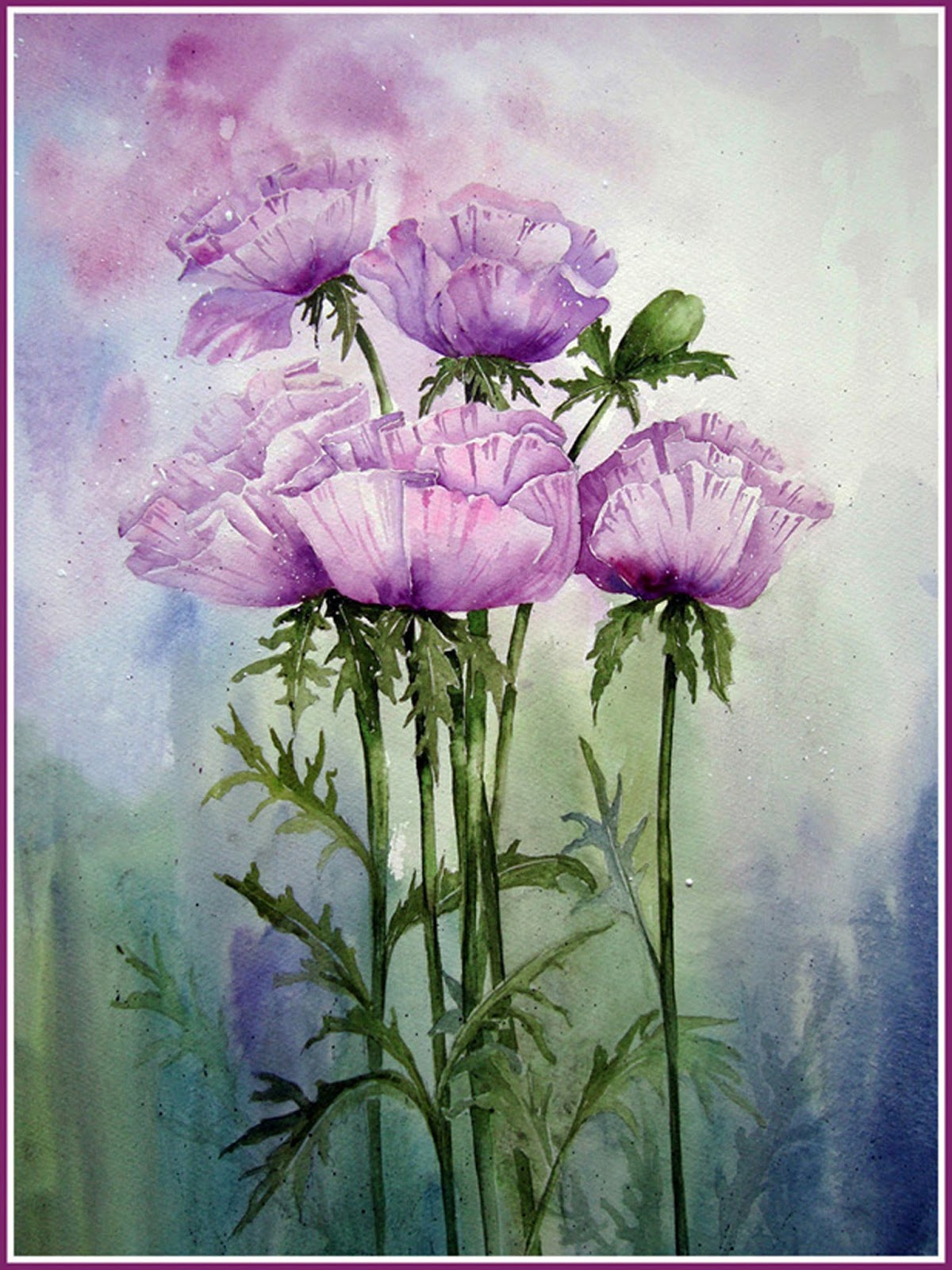
I have two main ways of going about the background. Either traditionally painting the subject first and then adding the background afterwards. I usually use this process if I am painting larger specimen flowers or still life objects. It means that it is easier to retain the white paper within the object....usually flowers, of course, and I can control the composition better as I can place the blooms where I want them.
This process usually leads to a much tighter painting, and quite a bit of anxiety, if I feel that the flowers have worked really well and have been time consuming. It is easy to fear wrecking it all with the background.
I have recently finished two paintings in this way.


In both these paintings, I did a careful drawing first, and painted all the significant blooms and leaves. I used masking fluid for stamens where necessary, and painted those areas first so that the masking fluid could be removed as quickly as possible. It is not a good idea to let it sit there too long as it can remove the paper surface when you try to lift it off.
I paint the flowers right up to the pencil line but not over it, which allows me to erase the pencil once the paint is totally dry.
When I am ready to paint the background, I decide on the colours......in these paintings usually greens and browns to replicate their growing position. I do however, nearly always add patches of the flower colour to maybe hint at further flowers in the distance.
To add the paint, I try to let the mixing happen by itself on the paper, starting by filling the smaller spaces in the middle with darks and adding lighter tones as I move outwards. So it is simply a case of wetting each area, and adding colour from a well laden brush, and dropping it onto the wet paper. by dropping in a couple of colours and leaving it to do its thing, there are rarely hard edges. I do use a soft tissue to dampen the edges if necessary so that there are no lines of division as I proceed to the next area.
I usually increase the intensity of colour in the corners, especially at the base, and frequently use a similar colour to the flowers in one of the top corners to bring some light into the painting. As I will use a big brush for the large areas, I keep a small brush handy to push the paint into the tight corners between stems, leaves and petals. I also make sure that there is colour continuity when the background is interrupted by, say, a stem. For me , it is important that areas on both side have the same colour to make it look natural.
If there are any poor areas, these can be rectified by gentle addition of a second wash when the  first is dry, and areas can be gently washed out, or the addition of extra leaves etc, left slightly fuzzy to indicate further back.
That's about it, really. It does need a bit of practice, but it is important to take it slowly, think about it and test the colours before adding to the painting especially if the subject has taken time and effort and has worked really well.

If I am painting a subject with lots of small elements, or I want a looser finish, I will paint the background first. It is really quite a simple job of wetting the paper, and dropping the colour onto the wet surface. The problem is that it is less easy to control and you can lose the white of the paper, so I often use White acrylic gouache to recover them.
I try to imagine where the flowers are going to go, and usually make the background darker on the left hand side. I blot out some of the edges and often add a few paint lines in one or other direction to help with the looseness.
I have to think carefully where the flowers are going to sit in the painting, and have to be quite flexible as the composition depends quite a bit on the results of the wash.
Then the process is very much the same for the actual drawing and painting of the flowers. This method enables me to much more easily include lost and found edges and to paint shadowy distant flowers in the background


When the painting is complete, I can add more pigment to any of the background areas that I think need more strength and can use the gouache to soften any edges I want to partly remove.

Both methods work well, it just depends on my mood, my subject and my image in my head as to what I want it to look like.

I hope those readers that have asked me to talk about my backgrounds have found this helpful, and that other followers of the blog have enjoyed reading it and found it interesting.

There are lots more examples, and photos in previous posts to browse if you want more details.