Wednesday 14 December 2011

Composition

As the Christmas season rapidly approaches, I have to think about closing down the studio and converting it into the guest bedroom. I have always known that the price to pay for having sole use of the second biggest bedroom for my studio has meant that whenever we have visitors, I have to give up the space whilst ever they are in residence. My mother is about to join us, so can see no possibility of doing much painting until the festivities are over.
I have, therefore been making a bit of a push to finish a piece of work which has been on the easel for over a week now, and that it quite a long time for me.


It was really coming along nicely, until there was enough work completed to be able to imagine the end result. Some bits of it are lovely, but I am sorry to say that the composition leaves quite a bit to be desired!

Now that it can be seen as a whole, it is almost a painting of two halves, which bothers me each time I look at it. My husband thinks I am too critical, but I do wish that I had arranged the flowers a little better and not followed my photograph quite so slavishly. In hindsight I would like to move the central yellow rose across to touch the spray of white roses on the left and slot another white rose between it and the lower right yellow rose.
I also wish that I had not had all 4 white roses on the left facing straight towards me. It would be more interesting if at least one of them was turned slightly away from centre.
I really must do a compositional, tonal sketch in future before I start, but I am always too keen to get on with the actual painting. Will I ever learn!    

Friday 9 December 2011

Only two more weeks to posting!

I have been so busy over the past couple of weeks, that I have given no thought to adding a new post to the blog spot. As the work has involved the production of my christmas cards, I thought I would share that with you.
The first task is to paint and produce our main christmas card. I need to have a good idea - in short supply after a number of years, and an inability to paint winter scenes - which then has to be executed and printed for about 100 recipients. Our friends are very supportive and are always keen to see what the current season will bring, which adds to the pressure. I usually paint it reasonably large, and then reduce it on the scanner using Abode Photoshop. I do not like cards which have their fold across the top, as they invariably do the splits in time for Christmas. I get my card from Halcyon Fine Art and he is able to supply an A5 landscape format card with the fold on the left hand side. There are lots of others to choose from, and they all come, if required with proper card envelopes with a diamond shaped flap.

This year's design is very simple.

This card comes to all who read this post, with my very best wishes for a peaceful Christmas  and a prosperous New Year.

In addition to the general card, I have 4 specials to make. I have 3 friends with whom I used to paint on a regular basis, but due to a variety of family reasons we are no longer able to do so. We have always, however, met together in the early part of December to swap gossip and wish each other well for the comming year. It became a tradition of the meeting that we would produce individual, hand painted cards for each other. I decided to stick to the same theme, and then had the great idea of using the original painting of the three pointsettia  for these three individual ones.I carefully cut around the flowers, painted more holly and red petals and stuck them all together to make three three-D cards.


Now I was only left with the most special card. Every year I have produced a hand painted card for our daughter. She is always very appreciative, but no matter how hard she tries to tell me otherwise, I know when she does not like it, so I do always give it my all!
Sticking to the same theme, I have adapted the ideas fron the three Pointsettia, and produced something similar but more refined. I am encouraged by the fact that she really liked the general card, so am hopeful that the theme, at least will go down well!


I am really pleased with the result, although the photo does not do it justice. It is difficult to see the effect of all the individual petals and leaves which are raised above the surface of the card. I am sure she will love it. Of course all the special ones have bits sticking up on them, so there is no way they can go into envelopes. Better get some boxes made!  A very Happy Christmas to you all.


Thursday 10 November 2011

Contrasts

Whew! What a week of contrasts! Last Thursday at club it was a case of abstract art, and this week I have just finished a flower painting as traditional as you could get. It certainly makes for an interesting life.
Last weeks club subject was abstract music. I do enjoy thinking about this type of subject, but lots of the members find it incredibly difficult to disassociate themselves from figurative shapes. Hence most members finished the morning with either surreal paintings involving musical associations like bits of notes or instruments etc, or graphic patterns with similar motifs. My take on abstract art is that if you know what it represents, then its not abstract. Having such a passion for flowers, I chose the musical rhyme....'Lavenders Blue, Dilly Dilly, Lavender's Green' and I am delighted to say that everyone who was interested had to ask me what it was, and where was the musical link.
In point of fact, I was much better pleased with the result than I had hoped, and will certainly look forward to trying some other subjects as starting points. I put lots of emphasis on texture, and included the use of clingfilm,salt,splattering and blowing the paint around the picture as well as a bit of collage of circles cut with a hole punch. The paper was quite wet at certain points so I was glad to have used a good quality paper,and I included watercolour paint, acrylic inks and watercolour pencils to produce the colour.

                                              300gm Fabriano Extrta White Not Paper with
                                                            mixed media 55cm x 45cm


A few weeks ago, I indulged in a few tubes of Daniel Smith watercolour paints, and one of the colours I chose was his 'Moonglow' which is marketed as a beautiful colour for creating shadows. Eager to try it out and see what it could do, I painted a cluster of lilac edged clematis. These flowers have very wrinkled edges to their petals, so lots of delicate shadows are needed to show this feature. I mixed tiny amounts of the flower colour ( Quinachridone Magenta ) with the Moonglow to paint all the leaf curls. Then strengthened the mix with a little more Moonglow to paint the very light cast shadows around the centres etc. I also used the Moonglow as part of the mix of Hookers Green. Prussian Blue, Windsor Green and Quinachridone Magenta to paint the background. In this painting I decided to limit the dark background to the centre of the painting and leave the edges pale. Hope you like the results!


                                                       Fabriano Artistico Rough Paper
                                                      Extra White 300gm  30cm x 45cm

Monday 31 October 2011

Autumn Glory

The view from my studio window is truly glorious at the moment. There are 2 silver birch trees wearing their autumn foliage, with the silver bark showing through the loose branches. When the sun shines through them, especially in the early morning and it is low in the sky, the colours are mouth-watering.
On Thursday morning, the sun was out around noon, and as I came away from Art Club, the bonnet of my car was up against a tall hedge of muti-coloured shrubs which give us lots of foliage choice throughout the year if we need something of that sort for the still life painting. This week, there were the most beautiful end twigs of what I think is Virginia creeper. I,m not very good on trees and shrubs, but the name is not really important,
What was inspiring, was the way the sun shone on these leaves which were buttery cream in place and a beautiful pinky orange or magenta in others, often on the same leaf. I could not resist. A discreet clip here and there and the minute I got home I had paper and paint on the go, so afraid that they would wilt and die before I had done my best to capture them in a painting.
Once the drawing was done, I flooded the paper with Naples yellow and a mixture of Naples yellow and Quinachridone Magenta, leaving bits of white and being careful to keep both colours separate in places to maintain the freshness of the colours. I then took a rubber to the drawing to remove any pencil lines which were in the unpainted ares to give me some lost edges. Finally, I had a great time painting the leaves, strengthening the colours where necessary, darkening the background behind the leaves, and finally adding more colour to the top left and bottom right, to leave a highlighted passage diagonally across the middle! Over the years we have painted so many autumn subjects, but there is always old favourites to try again, and new exciting ideas to develop. I hope you enjoy looking at the painting. I am pleased enough to mount and frame it.

                                                 Watercolour on Centenaire 'not' paper
                                                             300 gm  30cm x 40cm

In addition to the Naples Yellow and Quinachridone Magenta, I also included Quinachridone Rust, Brown Madder, Nickel Quinachridone, Cadmium Orange, and Indigo in the background.

Thursday 27 October 2011

Fashions in Flowers

I am frequently struck by the way flowers seem to go in and out of fashion, but seemingly they do.When I think of the pattern of sales over the past few years, it seems to support this premise. I suspect that those flowers shown frequently in gardening programmes and those chosen as star performers at the great gardening shows are bound to have their moment of glory, but there are definite trends apart from this. A number of years ago, lavender was all the rage and I sold almost everything I painted , this was followed by opium poppies, then wild flowers like buttercups and dandelions, then we had the sunflower, then the hellebores, then Iris.I've had a bit of a run on foxgloves as well. Now, I am hoping that it is the turn of the agapanthus.
I am besotted by these beautiful stately flowers and I love their gorgeous blue colour, especially the deep blue ones. I have never painted nor sold many blue studies, so maybe the time has come!
I have tried endlessly to grow these in my garden (together with delphiniums) but they do not like the soil. and although, from time to time, I get plenty of leaves, I have only ever had one fairly pathetic bloom.
Against my better judgement, I have just acquired a large pot planted with two varieties. For the time being I have left them in the pot to over winter, so they can be more easily protected. I have painted the flowers from this pot 3 times recently as I cannot be sure if they will flower again next year. I am ever optimistic!At the last exhibition, I sold the only one I had previously painted, and regretted it as soon as it left the building, so I now have the dilemma, about which one to keep and which to put up for sale in the next exhibition. Isn't life hard!!

I hope you enjoy looking at the three paintings and would be interested to know which you would keep, if any!


 All three are painted on Fabriano Extra white 300 gm paper. I have as feeling that the 3rd one is suffering a bit of bad photography, and the colour rendering is not quite as good as it should be.

Tuesday 18 October 2011

Having Fun

I have beeen browsing my copy of Ann Blockley's latest book....'Experimental Flowers In Watercolour' (published by Batsford) and thought it was time to have a bit of fun throwing paint at paper in a reasonably controlled way.
True to my expectations it was great fun and I will definitely have another go. I did a quick drawing of some Foxgloves so the I would  have a vaguely recognisable flower painting at the end of the session, and with plenty od water and paint I loosely put in the flowers. I sprayed them whilst wet which gave a bit of bleeding which was good, and then I really let go and splashed great amounts of fairly dark mixtures of paint around the flowers. I think the idea is to be very free but still in control!!
The resulting background, I though was fab and am looking forward to doing it again. I think maybe I should have spent a little more time in contemplation between the processes, but I was afraid to tighten up again if I didn't tackle it swiftly and uninhibitedly.
I used lots of indian ink, brown and white acrylic ink and plenty of Venetian Violet and Paynes Grey and Indigo.
Word of warning....wear a good large apron. My splashing went everywhere and I had to put my trousers pretty quickly into the wash as they were black and became covered in white and magenta speckles!!

 
The foxgloves do look quite controlled, but they are in fact quite loosely and quickly painted. This might be more obvious if you click on the image and enlarge it. Painted on Centenaire  300gm Rough paper, 12 X 16 ins.

Saturday 15 October 2011

Making Something of nothing

The past two weeks at club, we have had subjects which didn't seem to offer very much scope. The first depended upon having an interesting garden at this time of year, which most of us are struggling with, and the second depended upon a shoe or pair of shoes. I am of that certain age when my shoes have to be more sensible than glamorous and hubby does not aspire to sartorial elegance either.
The first week, however proved less difficult as it was surprising what I could find either in the garden itself, or what I had saved and dried on the studio shelf, These I took with me and simply drew the objects, including rose hips, poppy heads, Chinese lanterns and bull rushes, intermingling on the page, and then had a go at painting them. By the end of the two hours I had a reasonable selection of 'pods and twigs' (the official title). Later at home I painted in the lower left background to help hold the composition down and to try to give a sense of it all growing excitingly together, and was quite pleased with the final result!

     
                                                   'Autumn'  watercolours on Centenaire
                                                   300gm rough watercolour paper

The second subject 'Shoes' left me with very few ideas about how to be imaginative with this title, and I have a lot of admiration for those members who managed to be very illustrative and tell some kind of story with their work. I, boringly, set about a very traditional still life using a pair of ankle boots that I found lurking at the back of the cupboard. Did I really ever buy, let alone wear white boots!!


                                         'New Boots'  Watercolour on Centenaire 300gm
                                         rough watercolour paper

Monday 26 September 2011

Pen andWash

Thursday's subject a fortnight ago was 'drawing exercises' : any medium (but had to be dry), any subject and any style.Not my favourite subject as I profess to be quite weak at drawing, but I suppose this is all the more reason to practise!
In the spirit of 'making them all count' for the 2012 exhibition, I chose to draw in permanant pen, as I hoped that this would enable me to add some colour later, as black and white drawings do not seem to sell that well for me.

'Sunflowers and Pineapple'
Permanant pen on hot pressed paper

I was reasonably pleased with the result and included in my portfolio to take on holiday with me to finish if the weather wasn't too good.
True to form, it poured with rain all day Tuesday so I added the promised wash to the painting. I did find it difficult to move the paint around on the hot pressed paper and was disappointed that the finished result was heavy and over-worked. But there you go, win some, lose some.


As I had taken the trouble to carry the sunflowers all the way to Cornwall, it seemed a pity not to make the most of them, so I paid over the odds for a couple of lemons, and scoured the holiday cottage for a couple of jugs or vases and had a second go to see if I could get something a bit more to my taste from the flowers. This time tha paper was Fabriano extra white and the weather was a lot brighter and I think the results are a lot better. See what you think.


Monday 12 September 2011

New Paper

Peter Ward was kind enough to give me a sheet of paper of the new product exclusive to Great Art. Its called Centenaire ( see one of his previous blogs) and is considerably cheaper than some of the more established manufacturers. One of the attractions for me is that it is very white compared to,say, Whatman.This is a must for me when I am doing my floral paintings, so I was quite interested to try it out.
At Club this week, the subject was 'Pots and Vases' and I used my sample sheet to produce the still life below.

The paper is 140lb not paper, I believe, and I found it fine to work on. The colours of the background bled well when painted wet on wet and the paint sat well on the paper for the objects. My only slight criticism, was that hard edges were difficult to soften once they had dried completely, and I did not like to scrub too hard as I was not sure if the paper would take this kind of abuse. It was just a question of keeping concentration long enough not to allow paint to dry until I was satisfied with the edges. Sometimes, at club, this can be difficult, as we all enjoy it as a social occasion as well as a painting session!

Also this week, I have had a go at a slightly different composition, putting detail at the top and having all the lost edges at the base of the painting. Usually I work the other way around. It came about because I saw a clever photograph of a bunch of flowers taken that way in a gardening magazine and thought it might be interesting to try out. Trying new things can sometimes be surprisingly enervating Not totally sure if the photo does the painting justice, but see what you think.


'Marguerites'  Watercolour on Fabriano Extra White
38cm x 28cm

Thursday 1 September 2011

Post Exhibition

It seems impossible that it is 6 weeks since I posted anything on this site. My apologies to all who have accessed it hoping to find some chatter and a painting or two, but it has been impossible to do everything, and this is one of the things that suffered. The exhibition in Wells Cathedral was a success beyond my wildest dreams, but was incredible hard work throughout the 10 days I was open. It had to be manned at all times and I am grateful for the friends who came to help.
Prior to the exhibition there was so much preparation, followed by 10 days in the cathedral, and then a week of trying to get the house straight again. After all of that I hit a bit of an anti-climax low, and panicked a bit about how to replace all the work ready for the same thing next year.
Thankfully, I am out of that now and have started to paint again, and today was our first day back at club after the summer break. The subject was a picture of a peacock in full display. It was a lovely subject and really good to be able to use some of the colours in the box that don't always get our full attention, like Prussian blue, Windsor green and transparent orange iron.

'Peacock'  Watercolour on Saunders Waterford Not

Despite being told that they are great, and investing a bit of money in them, I am not having too much success with the sable brushes. I do use the bigger ones, sizes 14 and 10 when I am doing washes as they hold a good amount, but the size 4 does nothing for me and I find myself reverting to the 007 series synthetic which I have always liked. I will keep at it , though as they did cost a bob or two!!

Friday 29 July 2011

What to charge

As the exhibition looms close on the horizon, I am trying to tie up all the loose end. The only major task left to do, was to bar code all the paintings ready for any sales to be processed in the Cathedral shop. The process of selling is a bit complex in the Cathedral, as we, the exhibitors are not able to take any money. All purchases are dealt with through the shop, which means that would-be buyers have to take a docket with the appropriate bar code down to the sales staff, pay for the goods and then bring the receipt back to the Chapter House to collect their purchase. As Wells Cathedral is the only Cathedral in England to have the Chapter House on an upper floor, and the stonesteps have been worn into some very strange shapes over hundreds of years and are very steep, this can be a bit of a chore. In some cases I tend to walk down to the shop with the client and the painting, so that they do not have to make a return journey. This can only happen when there are two of us behind the desk and this year that will not happen very often! All this depends upon trying to explain to non-speaking foriegners why I cannot accept the notes they are offering me, especially for my boxes of cards.

The cards are a great product. They are A4 folded to A3 and there are 8 designs in each boxed set and I sell them for £10.00.Every year I sell out completely so each year I produce a few more boxes and this year there are 30 of them. I hope to sell all of them and the profit (not as much as you would think!) will just about cover all my incidental costs such as advertising, printing, postage, petrol etc.

I try to make the boxes as professional as possible, the card is bought pre-folded and comes with proper card envelopes. Each box is lined with tissue paper and the boxes are white glossy 'book boxes' (size of a standard paperback book)


The above pictures show the box lid design and the selection in the box which is pasted on the base.

Back then to the last remaining task: sticking on the bar codes. This can only be done after I have put the paintings into price groups and decided what price to attach to each group. I find this so hard to do. I do not want to undersell my work, but do not want to appear as if I think the work is worth hundreds. Also, I am aware that times are quite hard financially for lots of people at the moment. And I do want to sell some paintings so that I make a few bob for the cathedral to encourage them to ask me back again next year. Finally I do want to re-coup some of the outlay involved in framing about 85 paintings and mounting another 30 or so.

Some artists measure the painting and charge by the square centimetre, but I find this very unsatisfactory as I always feel some are better works than others even though they are the same size. Also the acrylics often do not have a frame so different rules seem to apply. What I have tried to do is produce a range of sizes and hence prices without compromising the way I want to paint. Although this year my paintings do seem to have grown in size somewhat and therefore I feel I have to charge more for them.
We shall see if I have got it right, although I am sure that the different month this year will have a knock-on effect on sales (last year it was the beginning of July)

As my friend, Jan, is unable to take part this year (she is the landscape painter, to my flower painting) I have included a number of pictures which are not in my usual exhibition range, and I have include one here for you to look at.

'Bottlemania'  Collage on Fabriano Extra white

Sunday 3 July 2011

Golden Lake

In response to a conversation I had with Peter Ward (http:watercolourfanatic.blogspot.com), about the possible disappearance of Quinachridone Gold, I had a look at replacing one of my favourite colours, Maimeri Golden Lake with a more readily available alternative. I love the Graham paints so looked at the possibilities within their range. As a consequence of reading Peter's latest blog, I thought I might share my findings with you.
I compared the two basic colours, Maimeri Golden lake and Graham Nickel Azo Yellow, and as I use the Golden Lake primarily to mix greens, I mixed the Azo Yellow from Graham with all the blues in my palette to see if there was a good range to satisfy my needs. The results are shown below. At the same time I also bought Azo Orange from the same range, and thought you might like to see those results as well when mixed with the blues. I found the Graham Azo Orange much brighter and less opaque than the Cadmium Orange I had previously used and am delighted with the lovely greys to be achieved.


The Bockingford Paper has no significance, jut a free pack picked up somewhere! It is quite difficult to mix absolutely equal strengths of paint in each test, but I think enough shows to make my point.I am happy to use the Azo Yellow until I discover something better, and the Graham paints are lovely to use.

Just to keep the floral interest alive, the background to the Orchid picture below was done completely with mixtures of Golden Lake and Indigo, both by Maimeri

Tuesday 28 June 2011

Composition

We are often being told that the composition on the thirds has the most impact and I have always tried to think about this when doing my drawings for the flower paintings. Also the advantage of having an uneven number of elements. Just recently, however, I find myself painting groups of flowers where the finished work does not conform to these two basic rules.
I suppose that all rules are made to be broken from time to time, and the more experienced one becomes, the easier it is to get away with it. I would be please to hear what you think about the composition of the paintings below, where most of the flower interest is in the top half of the painting. Maybe its just that tall blooms lend themselves to this type of composition.


Tuesday 31 May 2011

Another 2 Hours!

As promised, the results of trying to put together a couple of small (for me) paintings for our limited space exhibition later this month. Lots of things on and so not a lot of time, so another 2 promised 2 hour sessions to see what I could put together. Here are the results. Now I feel justified in making up my allotted number with a couple of large paintings to advertise my August exhibition.

                                        'Anemone Japonica' Watercolour on Fabriano Extra White
                                                                        22cm x 32cm

                                     'Cherries and Grapes'. Watercolour on Fabriano Extra White
                                                                18cm x 27cm

I keep telling myself that I now have enough paintings for all the projects I have in hand and I can take a rest and do a bit of cleaning or something, but there is that compulsion to always do 'just one more' so I will not say 'that's it folks' because I am sure it will not be!

Sunday 22 May 2011

2 hours on a Saturday Afternoon

I have enough paintings stacked in the attic for the exhibition in Wells Cathedral in August, but we have a club exhibition approaching, which will be held in our painting venue. There will not be a lot of space, and my paintings are generally in frames 20" x 16" or 26" x 20" so they are relatively large. Also I do not really want to eat into my stock for Wells.
I have been working for the past 3 weeks and have done no paintings, so the need to deal with the withdrawal symptoms and the need to find 4 or 5 smaller paintings for this local exhibition, made me make time on Saturday afternoon to try to produce something which would fit a 12" x 16" frame max.Not something I am very good at!
A garden full of early roses seemed a good starting point, and I set to, without any pressure, and the usual ....its only a piece of paper....... if it doesn't work.

What a nice surprise, when 2 hours later, I was able to think 'That will do!'

Now all I need to do is produce a couple more and the problem will be solved. I will show you the others if they turn out well enough, but here is the first.

                                            'Alexandra Rose'  approx 12" x 9"  watercolour on
                                             Fabriano xtra White

Wednesday 18 May 2011

Developing A Style

At Art Club this week we were asked to produce a painting of white china on a black ground, any style, any medium. At the end of the session, all the paintings were put up for our usual group chat and appreciation session. We have found that we can all learn lots by looking at each others work, asking questions about technique and composition, and because it is a really positive exercise, even the weakest members are happy to take part.

As one of the organisers of the group, it has often fallen to me to lead this session and sometimes suggest discussion points. When I have done this, I have nearly always been able to put a name to a painting for at least two thirds of the group. The beginner's work is sometimes a bit more tricky as they have not yet developed a distinct approach to their art.

I hesitate to use the word style as I am not sure that even the more established painters amongst us always paint in the same way.

This was highlighted today as the confines of the white china and black ground seemed to do away with all the usually recognisable paintings, and I would not have known whose painting belonged to whom, except that I finished a little early and had a wander around all of the group.

So, what I am asking is this......At the level at which a club like ours paints, are we really developing a style of our own or are we simply working in a way which reflects the work of artists we admire. Had they never put paint brush to paper, how might we have developed? Are we capable of painting in a really individual way which would be easily recognised as 'ours'.

I am sure that for all the years I have been painting, there are lots of different ways in which I produce paintings depending on the subject, the medium and my mood. I say thank goodness for that. it keeps me fresh, encourages me to try new things and stops me trying so hard to paint in a certain style that I lose my way completely.


I have put together half a dozen paintings of the same basic subject. Are they recognisable as mine?  Am I developing a style of my own, or am I just striving to produce work based on those artists I admire.

I actually do not care. I do not think anything except my health would stop me painting, even if I never sold another painting!


Tuesday 17 May 2011

Developing A Style

At Art Club this week we were asked to produce a painting of white china on a black ground, any style, any medium. At the end of the session, all the paintings were put up for our usual group chat and appreciation session. We have found that we can all learn lots by looking at each others work, asking questions about technique and composition, and because it is a really positive exercise, even the weakest members are happy to take part.

As one of the organisers of the group, it has often fallen to me to lead this session and sometimes suggest discussion points. When I have done this, I have nearly always been able to put a name to a painting for at least two thirds of the group. The beginner's work is sometimes a bit more tricky as they have not yet developed a distinct approach to their art.

I hesitate to use the word style as I am not sure that even the more established painters amongst us always paint in the same way.

This was highlighted today as the confines of the white china and black ground seemed to do away with all the usually recognisable paintings, and I would not have known whose painting belonged to whom, except that I finished a little early and had a wander around all of the group.

So, what I am asking is this......At the level at which a club like ours paints, are we really developing a style of our own or are we simply working in a way which reflects the work of artists we admire. Had they never put paint brush to paper, how might we have developed? Are we capable of painting in a really individual way which would be easily recognised as 'ours'.

I am sure that for all the years I have been painting, there are lots of different ways in which I produce paintings depending on the subject, the medium and my mood. I say thank goodness for that. it keeps me fresh, encourages me to try new things and stops me trying so hard to paint in a certain style that I lose my way completely.


I have put together half a dozen paintings of the same basic subject. Are they recognisable as mine?  Am I developing a style of my own, or am I just striving to produce work based on those artists I admire.

I actually do not care. I do not think anything except my health would stop me painting, even if I never sold another painting!


Friday 13 May 2011

Developing a style

At Art group this week we were asked to produce a painting.....'White China On Black.' Any size, any medium. Not something that proved to be easy, especially as the ground for most of the members work was not really meant for wet media, and lots of us tried to use acrylic inks!  As usual, at the end of the session we put the paintings up against the wall, and had a look at what we had produced. Members enjoy seeing what others have produced, and we all believe we learn from looking at each others work. There is such a supportive atmosphere, that even the weaker members of the group are happy to take part.
At these sessions, as one of the organisers of the group, I often start the ball rolling and have become so accustomed to looking at members paintings, that I can recognise 75% of them from their style of painting. The weaker members are a bit more tricky as they have not really developed a style of their own yet.
This week, however, it was much more difficult and the only reason I knew one painting from another was that I had finished a little early and taken a stroll around the room.
I do not know if it was the very limited subject or the unusual process of painting directly onto a black background, but there seemed to be no recognisable styles present. Everyone seemed outside of their comfort zone to some degree or other.

This got me thinking of the much used phrase of.......'developing a style of ones own'. Do we really do that or do we in fact, mostly try to emulate the work of well known artists that we admire, and so are generally just working towards their style? Maybe only the exceptionally talented can actually be so innovative that the resultant style can truly be called their own.
True, there are artists whose work I really admire, and a style of painting that I would like to see in  my work, but that does not mean a style of my own. What I am trying to do is produce paintings that contain to a small degree, something of their individual style.

All this is very theoretical, and really doesn't matter that much except as an interesting concept, and whoever or whatever I tend towards, and whether I have any sort of 'style', whilst health and enthusiasm continues I will continue to paint in my way!
As an exercise I have collected together a few of my paintings of the same basic subject to see if one would suggest that they all were done by the same artist. See what you think.

                                                                             Poppies Galore

Wednesday 27 April 2011

Self Belief!

I have a beautiful display of reticulated iris beginning to burst forth in the garden, so I have been keeping my eye on them ready to do a painting. I am generally ok with specimen flower painting, but wanted to have a go at something a bit more complex, with lots of blooms growing together, in the style of the foxgloves, agapanthus, tulips etc that I have posted previously.
In order to get my head around it, I was perusing a couple of inspirational books of what the editors chose as some of the worlds best flower painters (The Best of Flower Paintings Vols 1 and 2, edited by Kathryn Kipp and Rachel Wolf respectively, published by Cassell- Northern Light Books) .Partly reading the info and partly looking at the paintings in a fairly random fashion, I was appalled to read that one artist, Airi Foote, had been curtly informed by a tutor that she had no talent! So discouraged by this remark, she gave up painting, and turned instead to gardening. She eventually decided that talent or no talent, she was going to try again and to hell with what anyone thought. She ends up in a book about  the worlds best flower painters. Although her painting is not really spectacular for me, it did make me think about how much these experts, so say, really know, how subjective enjoyment of visual images is, and how careful we have to be when talking about other peoples work.My Art Teacher at school was much more kindly and informed my parents at an annual assessment meeting, that I had trouble knowing which end of the paintbrush to use! Thank goodness that did not put me off.
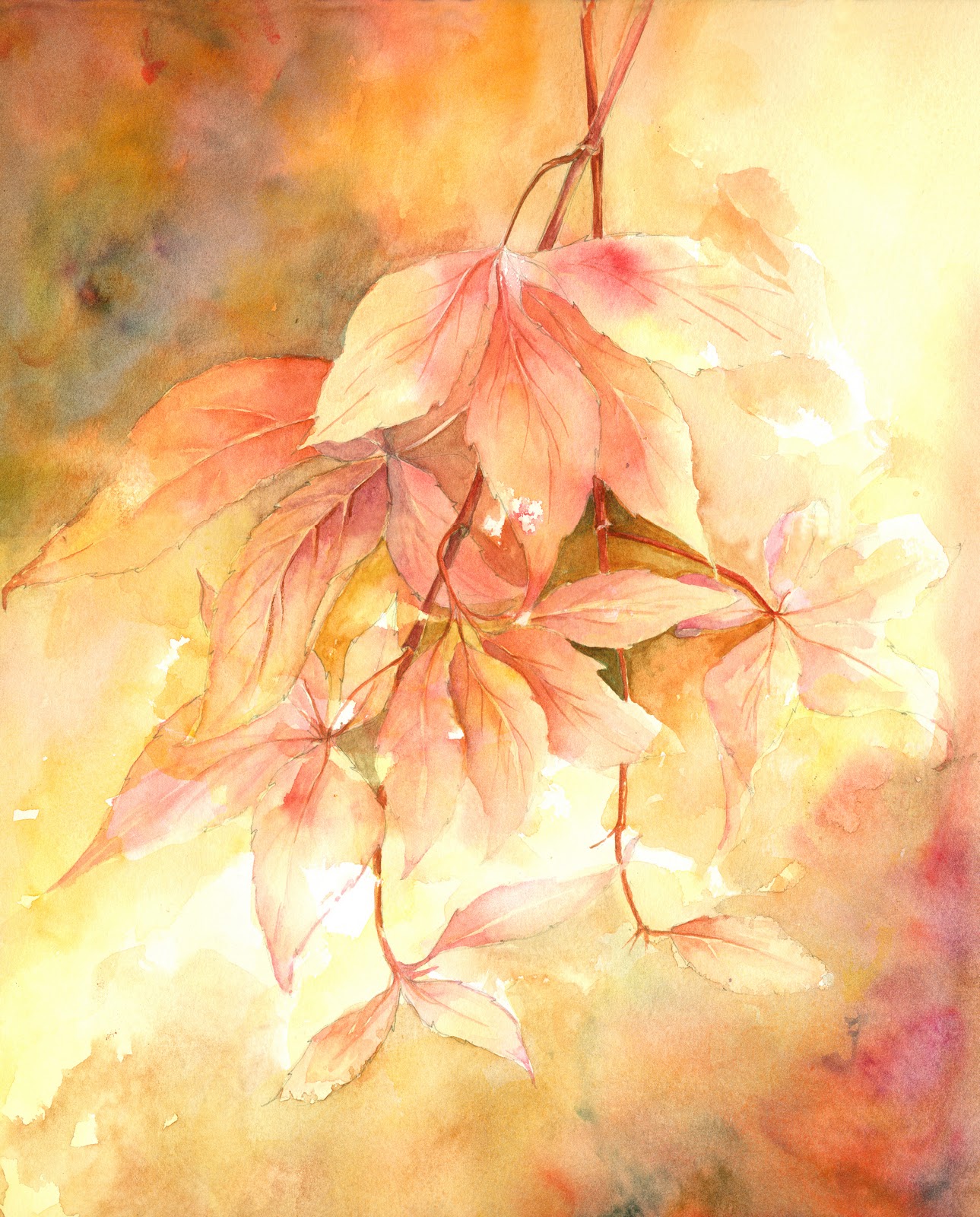
 What I did like about the painting, and what caught my eye in the first place, was the combination of colours used in the leaves and background. Not colours I regularly use, so I thought, give them a go.

                                            White Roses by Airi Foote  11'' x 14''

She talks about using a combination of such colours as Permanent Rose, Winsor Violet and under painting with Aureolin Yellow to give it a glow.
I dug through my mountain of photos from my garden, and found something in a similar style to her source material and using my favourite Fabriano Extra White did the basic drawing.


This is one of my favourite roses that regularly do well in my clay soil, so I have used them quite frequently for paintings and have been pleased with the outcomes. I tried to paint with a mixture of her suggested colours and some of my favourite ones including quinacridone violet, quinacridone rust and transparent orange iron oxide, all of which are from the M Graham and Co range. These paints have a lovely texture, moist and easy to put into empty pans, where they do not dry out to any degree, and they have a lovely glow to them. They can be quite staining, so cannot easily be lifted if used in the concentrated form, but I love them.
I did try to keep away from too much traditional green in the leaves and I tried to keep my background lighter than I might normally paint around white flowers and the result is ok.

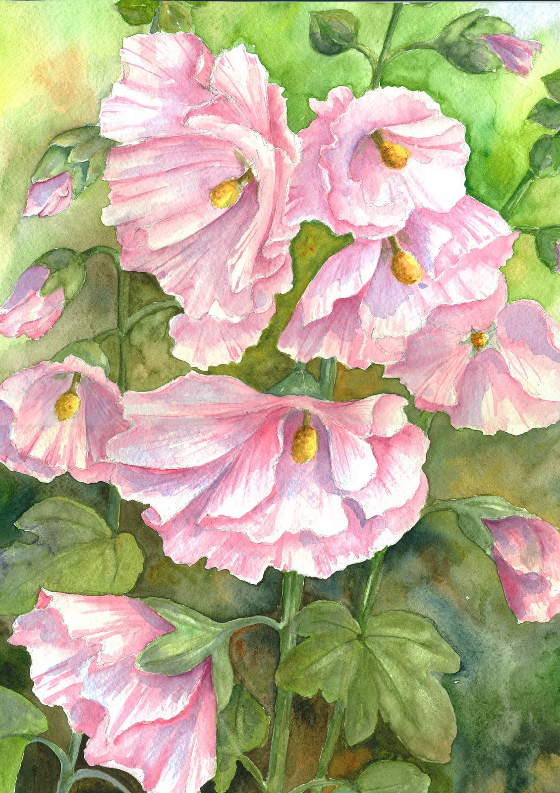
In hindsight, I would have changed the composition slightly and had a couple of the flowers overlapping to make the painting hang together better, but nothing I can do about that now,what is done is done!


                                           'White Roses' Watercolour on Fabriano Extra White
                                           paper. 9'' x 13''

I hope that the use of Airi's work from this book comes under the heading of 'Review' and conforms to the 'brief passages' that any reviewer is allowed to use.

Saturday 16 April 2011

Which comes first?

'Rhododendrons'
  Watercolour on Fabriano Extra White 300gms  48x33cms


One of the questions I get asked most about my work is which do I do first; the subject or the background. I have to say, in all honesty, that there is no hard and fast rule and I can paint a piece of work either way.
When I was starting this painting, I did give it some thought and realised that it was not as random as I might think, and there are factors which influence the way I proceed.
My backgrounds are deliberately very loose and produced with a great deal of water and wet-in-wet painting. I do it this way to help counteract the formality of the subject which can be painted quite tightly ( not something I necessarily want to achieve, but that's just the way they come out). They are therefore quite spontaneous, and do not take too long to add to the work, but they can be quite hit and miss. So, the rule of thumb tends to be the more complex the flowers, the more likely I am to do the background first. I do not want to spend hours painting the flowers and then to mess up the background. Simple flowers are painted first and the background added afterwards to give them some contrast.  White flowers often have their backgrounds painted first as this helps to define their shapes within the picture.
Having said all that, these complex rhododendrons, almost white should have had the background done first, but contrary to all I have just said, I did in fact paint the flowers first. I cannot give a reason for this, it is just the way it progressed.
I am really glad I did it this way. I did a detailed drawing taken form a couple of snaps of the flowers in my garden, making sure that the sun was in the right direction in both photos.


I painted the two main blooms, and realised that the composition was unbalanced, so to rectify this, I added, from another snap I had, a large bud to the right hand top corner. (The leaf coming from this bud towards the right could have been a little better placed as it tends to skim the top of the upper right trumpet.)
My reason for pointing this out is that had I painted the background first, I would not have been able to make these adjustments and the painting would have been that much weaker.
Another point in favour of painting the background last, is that I do like to include some of the flower colours in the background to link the two elements together, but it also helps to give the impression of other blooms behind the main elements.
So there we have it. 'Rhododendrons' ....flowers first, background last.

Monday 11 April 2011

Mounting a Painting

I have been having a look at my blogs to see what I have included and what else I have in the collection that does not appear here or on the web site. Now that I look again I realise how weak the Lilac looks in comparison to others I have posted, so I applied myself to a part-finished painting to give my confidence a boost and the result is here.

Hollyhocks: Fabriano Extra White 300gm
26 x 36cm


The original painting was slightly larger than this, but I did want it to fit comfortably into a 20x16 frame as this seems a popular size at exhibitions. I had painted the tops of the hollyhocks with their unopened buds, but the framing would have had the mount cutting right across the lower left flower and this seemed a bit 'uncomfortable'. I played around with 2 L shaped pieces of mount board and even rotated them slightly to make the central stem go very slightly across the page, and although I would have liked to include the buds, I felt that this was the best compromise.
For my mounts I always use antique white mount board by Colourmount, with a slight weave pattern to the surface, and I then use a variety of white frames either commercial or home-made. I seal the backs of the frames with heavy-duty gummed paper, as I have yet to find a sticky backing tape that stays in place. It only need one corner to lift slightly and it plays havoc with the bubblewrap bags in which the paintings are stored.

Saturday 9 April 2011

Summer's Comming

This week's club subject was 'Village Fete'. One of those subjects where I do not think I could get away with painting a pot of flowers, so it was a case of looking for something that avoided people, animals and too many  buildings. Although I do accept that this sort of compulsory programme does take you out of your comfort zone and pushes you in to subjects that you would normally avoid like the plague.
Found this picture in the google images library, and as an ex textiles teacher with an interest in pattern and design, thought it had great shape and colour. Was undecided about whether to mask out the ribbons before painting the sky, but in the end went for careful painting of each section, remembering to blot out the clouds in such a way as they continued behind the ribbons. Think it works ok, so thanks to whoever took the photo, no name was given so I cannot acknowledge the original 'artist'.

Such lovely weather sent me out into the garden this weekend, and we have a lovely Lilac tree in flower at the moment, The colour and perfume are lovely at this time of year as they promise lots of floral goodies to come as the weather warms up.
For someone who paints flowers as often as I do, I never really feel intimidated by a floral subject, but these blooms were really something else. I have talked before about what to put in and what to leave out in a previous blog, which is a challenge in itself. Add to that, really bright warm sunshine and a good breeze, so that nothing stays wet long enough to get a decent wash, and I wished I'd never started. I did keep going, as I have fond memories of Lilac, as it was the subject of the first painting I ever sold above club level, and I remember how it felt to know that a total stranger wanted to live with one of my paintings.....heady stuff! It will not get framed, but I might put a mount around it to include in the 'bargain' browser!


Friday 1 April 2011

Creative Thinking


Club subject this week was Spring Flowers. After the high winds over the week, the pansies were all that was left in the garden, suitable for taking with me. I was pleased enough to finish it when I got home. Hope you enjoy looking.

Its funny the things you take for granted, and when they cease to be, you do not quite know what to do about it.
I have always, since way back, produced my own greetings cards. To start with, it was just for family and friends birthdays, and Christmas. It grew a bit when I started going to craft fairs and selling the cards, and although there was no great profit, I always enjoyed chatting to the customers and it kept me busy.
With the advent of the annual painting exhibitions, I have been able to sell quite a few more and they are a useful advertising tool. Finding the right paper and printing format has been a case of trial and error, but producing the images has been a simple case of scan in the image, adjust it slightly in Photoshop, add a border and print onto the card.
With the need to start planning for Wells in the summer, I have been looking at this years work to see what might print well. I buy white gift boxes and package the cards in a way which makes them suitable as gifts, or they can be framed separately for anyone who cannot afford to buy a painting, or just as a set to send out to friends, as they are a real bargain at £10 for a box of 8 A5 cards and envelopes. Every year I have sold more and more boxes, starting tentatively with half a dozen to see how they went and last year selling 20 boxes in the space of 5 days. This year I have ordered 30 boxes and we will see if we can sell them all!

There is, however, a problem! I have always painted on 'not' paper, and in the printing process the texture of the paper has never had a negative effect on the reproduced image. This year however I have bought quite a lot of 'rough' paper and produced some lovely images, but when I scanned them into the pc, the texture of the paper is quite evident and spoils the painting in the printed form.
I have spent ages in Photoshop trying to remove the texture of the painting to no avail, and thought that I would have to resort to re-using some of my older paintings for this years selection. Whilst making my mother's Mothering Sunday card, I reduced the size of the image to see if that would help, as you obviously lose detail when you do that, and then I enlarged the 'canvas' to get it back to the right size to print, without realising that it was set onto a coloured setting.
The resultant card set me thinking that this was an easy way to overcome the grain problem and with no more ado, the chosen images have been produced in this format, which I hope will sell well. If not, then friends and family will get a box each added to their Christmas parcel!!
Four of the eight resulting designs are below for you to see what you think.

Thursday 24 March 2011

How much detail?

I started a still life this week-end when I was inspired by a picture of a lovely brass watering can, and thought that some other elements of a painting would give me some lovely reflections. As always flowers would be quite an important part of the finished work, as well as a bit of lace cloth (as an ex- textiles teacher I am always fascinated by bits of fabric!) I pulled out various bits from my china cupboard and raided the fruit bowl, and thoroughly enjoyed putting together and painting the picture you see above.

The question running through my mind whilst I was putting this still life together and executing the painting was what do you put in and what do you leave out! The Hydrangea are complex flower heads and the skill is to know which flowers do you paint in, and how do you deal with the rest of each mop head to still give the impression of a mass of flowers.

Similarly I did not want the lace to be too photo-real. I wanted to be as freely painted as the flowers so that those two elements were a foil for the more sever lines of the jug and watering can.

I included the fruit as they were small enough to give me some reflections in the copper can.

I am pleased with the result, and it looks well in its mount and frame, but it is something that I will keep having a go at, as with lots of flowers, there is often too much to paint it all, and something need to be left for the viewer to imagine or the whole thing quickly loses its impact.

The painting was done on Fabriano Extra White on a block as usual. I am finding, however, that more and more often, the block does not hold the paper flat, because of the amount of water I use to create my backgrounds. So, maybe one of these days, I am going to have to buy sheets and stretch them each time, which I really do not want to be bothering with.

Friday 18 March 2011

Publishing

I have been thinking, this week, that I have painted quite a few images just recently, and maybe the time will soon come when I put a second books worth together and have them printed.
My first book came about through a colleague who had put together a beautiful book of the photos taken during a once in a lifetime safari holiday. It was lovely to look at, and a lovely souvenir.
My family live a considerable distance from me, so they are unable to get to my exhibitions, so it seemed like a good way of showing them my best (in my opinion) work. It is also a lovely hands on record of lots of the paintings which are sold - some of which have gone abroad.

I looked at the site she had used and after a few false starts, put together my first book of paintings.


The company I used was 'Blurb.com'. I found it reasonably user friendly and being familiar with image manipulation programmes like Adobe Photoshop, any problems were ironed out with a bit of imagination and patience!

It takes you logically through every stage of the process, enabling you to put several images on one page or not, adding text and titles, numbering the pages and creating an index. It even allowed me to place large paintings across a double page spread. The only problem I had was in the editing! It is worth getting someone to proof read the work, as I found that I read what I thought I had written, and not what was  really there.

Blurb also allows you to sell your book from their site and reap the profits!

I was really pleased with the results, and some months later, when invited to a 70th Birthday do, and requiring a gift for someone who seems to have everything, I put together a second book, as an autograph book for the occassion. The front and back covers were two paintings my  friend had bought from me, and inside I wrote a small piece about our friendship and the occassion.
On each of the susequent pages, I put a small version of one of my paintings, leaving space for all her guests to write a few words and sign their name. Everyone was delighted, and I felt that she had a really lovely individual gift. I will certainly think of doing another one, should the occassion arise.


Maybe my next book should include a much wider selection of paintings, not just the florals, as I seem to be doing lots of other stuff at the moment, not least because of the compulsory nature the programme at the group to which I belong.

Saturday 12 March 2011

Adapting the image

With all the pressure on me to get together enough paintings for the summer exhibition, I have been looking at my portfolio to see what I can use.
It seems to me that even though Art is very subjective, and what one likes, the other might hate, there are fashions and trends in Art. We, all of us,develop our style over the years, and some artists make quite radical changes to what they do. Shirley Travena is a good example of this. I saw her demonstrate a couple of times, producing 2 of her classic florals. However she is now very taken with her attempts at painting the landscape, and I am sure she will develop this side of her work. I have changed the style of my work quite a lot over the last few years and some of the work seems quite passe to me and would not fit in with what I am trying to do at the moment.

I have, therefore been having a look at some of my earlier work, with the idea of bringing it a bit more in line with my present painting style. I have recently been painting florals and still lifes with much darker backgrounds so I thought I would add backgrounds to a few to see how it worked.


In my opinion, these paintings are now better for the addition of the darker background, and hopefully they will fit more comfortably with my newer work.
Today I have had a go at a large acrylic canvas in the same way and the painting is sat in the studio drying, and the impact is certainly, for me, much more immediate. See what you think.


Sunday 6 March 2011

Progress

I hope you enjoyed looking at the paintings. I have had loads of grief trying to set up the blogspot, and I am grateful to Peter Ward for his unstinting help and advice (http://watercolourfanatic.blogspot.com/)
 
I will only post a couple of paintings at a time in the hope that eventually the site will pop up in Google, and it should not be too large to open.

I am busy trying to get together a number of paintings for the annual exhibition in Wells in August. This is normally a two-man exhibition, but it looks as if my colleague may not be well enough to take part, so I will need upwards of 85 images!! Thank goodness there were plenty left over form last year. As most of our visitors are tourists this is no big deal.

White Lilies

I painted an abstract landscape at Avon Valley Art Group (which I help organise with 2 fellow painters) this week, but when I brought it home there was a great debate about which way around it it looks best. Unfortunately I cannot show it at the moment as I have a new pc and the scanner is too old to be downloaded into the new system, so I have to get a new one. I prefer to scan rather than take a photo as I find my camera does not always make a good job of the colour rendering. Todays offering therefore is from the collection. Hope you enjoy looking. 
Yvonne