Monday 23 July 2012

Orange Lilies


This turned out to be a lesson in just how far to take a painting with due regard to ones ability!!
I wanted to do several new things, another chance to use the unstructured Thursday session to try something a bit different.
I think, in hindsight, there were too many new and different things going on, and I have realised that sometimes it is better to really consolidate certain skills before proceeding onto something new, and only introducing one new thing at a time..........or is it just a case of if you want to have fun and experiment, it doesn't always work!

I wanted to do a bigger painting than normal, I wanted to question some of the compositional rules and I wanted to push my experimental, loose approach even further. I am disappointed with the result, simply    because it did not turn out as I had hoped. However, my annual exhibition has taught me that people buy and admire all sorts of art, and some paintings that I felt were failures for one reason or another, have been bought by people who genuinely thought they were beautiful. Thank goodness we are all different!


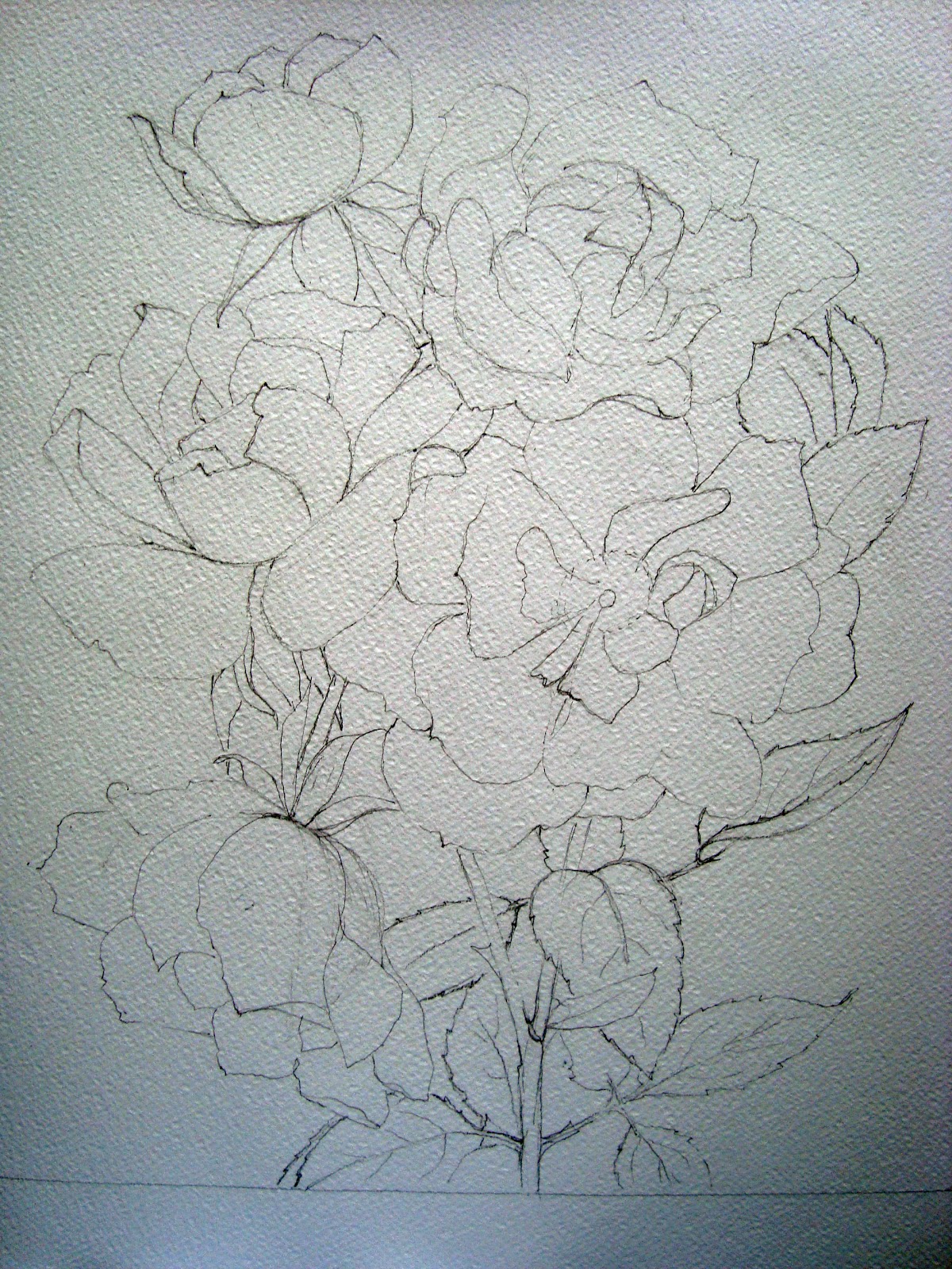
The drawing stage was fine. The paper is Whatman Rough 300gm  and measures 57cm x 39cm. I did however, deliberately place the heavy blooms on the RH side of the picture and leave the LH side with only foliage and buds. That was my attempt to play around with composition, to see if it works when one pushes the rules a bit too far!


The start of the painting was ok as well. Doing what I normally do by creating a relatively traditional flower in the first instance. Even at this stage, though, I was beginning to feel slightly worried. It was not as vibrant and 'clean' as I wanted it. Th colours in the photo are stunning and I really wanted to capture that. 


I did wonder if it would help if I got rid of some of the white behind the flower in an attempt to add more contrast and make the oranges more vibrant.


My concern about the painting at this stage clouded my brain, and I continued with all the background, which was another mistake as I was then left with a painting I did not think could be salvaged, and a great mass of white paper in one corner which still had to be painted. I should have stuck to my usual system of painting all the flowers before adding the background, so that there was more chance of getting it right!


With the intention of getting more vibrant colours, I painted the second flower with everything I possessed, watercolour, gouache, acrylic ink and water soluble  pencils. I so didn't like the painting at this stage, that I no longer cared what happened to it, so I approached it with gay abandon, and at times felt like Jackson Pollock on one of his bad days.


The painting did get finished, I still do not think it has a lot to commend it.....too much splatter, too overworked, and the composition could be a lot better......but it has made me think. I share it with you simply to show that even when we think we have a little talent, things can go horribly wrong ......it doesn't always work.

Saturday 14 July 2012

Summer Meadow

Time to have another go at the experimental stuff. Out came the doilies again and this time I wanted to try a more multicoloured composition. My intention was to work on the idea of a Summer Meadow. There would be lots more colour and the design would grow from the bottom up! That was the theory, anyway! I used a piece of watercolour paper, covered it with PVA glue and rollered a piece of crumpled tissue paper onto it and let it dry. I then added some streaks of Gesso to the surface to give me a bit more texture.


Whilst waiting for the support to dry, I used a couple of my precious stock of doilies and painted them in various shades of meadow flowers: the blues, the yellows and I still had the bits of pink left. Although its not in the picture, I also painted a bit of poppy red as well.


When the support was completely dry, I washed the entire surface with the colours to represent my field, starting with some dark greens and gradually becoming sky blue at the top. I left plenty of pale areas to give as great an impact as possible to the so called flowers.


Then, with lots of sticky cutting and pasting, I cut up the doilies, and positioned them on the support, trying to make them grow up through each other as they might do in a summer field.


When I was satisfied with the amount and variety of shapes and colours, I added dark watercolour to the base of the painting, ( sorry, not as evident as it should be in the photo) and added some all important red pieces to the painting.I added stems and greenery where needed, as well. Lots of splashing with the gouache and with some of the colours in the picture, and I thought maybe anything else would be a step too far


I an really quite pleased with the finished result, but am aware that the use of so many colours has resulted in a painting with much less impact than 'Blossom' or 'Cow Parsley, which rely heavily on the monochrome treatment. However, I do think that from time to time, something a little more restrained can have a certain appeal. I hope you think it has some merit!

PS   having looked at the published post, I am unhappy with the area of really dark brown on the left hand side, and during the mounting process, have cropped the painting to include very little of this part of the painting!

I have just started the drawing for a painting of Orange Day Lilies (Hemerocallis) and it is double my usual size, so it may be a little while before I have anything new to show you! Happy painting!!

Use Of Gouache

After my last post, Mick Carney asked me why I use gouache  and what prompted my approach to the work I am doing at the moment (excluding the experimental stuff!).
Like so many things that we do, it can be difficult to pin point the moment when you make a decision to follow a  certain path. However, I do remember having tubes of Chinese White in my box of tricks, just in case I forgot to leave the highlights where they should be, etc. I always found the paint in the tube to be hard and dry, presumably because I did not use it enough! If I added a drop of water, it seemed to lose its covering power.
A friend had been on a course or to an art sale and had acquired a tube of acrylic gouache white. It did a grand job, was nicely fluid and had good covering power for highlights etc. The only problem was that the manufacturer (whose name eludes me at the moment ) had stopped producing it.

Following that, I did a day course with Sorya French (apologies if her first name is spelled wrongly ) using acrylic inks and I bought several bottles of white Daler Rowney FW acrylic ink. It did a reasonable job and I used it for quite some time.

I was making an effort to really loosen my figurative floral work, and Peter Ward  (http://watercolourfanatic.blogspot.com) was king enough to send me an email containing some amazing work by far eastern artists that he had come across on Wet Canvas or Facebook. They were amazing!

The two that really started me off are printed below, and I apologise for not accrediting their work with their names but these are not always readable.


I studied the images closely and decided that the white areas could not be white paper and came to the conclusion that it was either white acrylic or white gouache. It seemed to be laid on quite thickly, so I did not think it was ink.
Wanting to have a go, I needed to order some more white paint and came across in Jackson's catalogue some acrylic gouache by Acrylicos Vallejo or AV.........just what I thought I needed, and the rest is history!

Another painting sent by Peter kept my nose to the grindstone!


In case any of you missed them, I have included a couple of the works that I did following this 'Damascus' moment.


Still a long way to go, but I am really enjoying painting with this combination of watercolour and acrylic gouache, and I am sure it will keep me busy for some time to come.
Hope that answers your questions' Mick!

Wednesday 11 July 2012

Pink Roses


 These lovely roses are again from my garden, but the photo (the big one at the bottom of the page) was taken last year when the weather had been better and the flowers so much more perfect than this year. I decided to do a square painting, as the source photo is more square than oblong, and I had a square frame that has never got used.. As usual, I did the pencil drawing as accurately as possible, but was not too worried about it showing through the finished painting as I intended to get the gouache out again. I wanted the finished result to be as loose as possible, much more so than the orange roses in the previous post. Therefore, I used a large brush and made bold sweeping strokes across the paper. The paper this time is Waterford Rough 300gm as I did not have a piece of Fabriano Artistico big enough for the square format. I am sorry the photos do not fill the frame, but this is due again to the square format.


This time, to try to keep the freedom, I painted all the flowers in the picture before adding any detail.I put in a bit of the background as before, and particularly like the top right hand corner where the background has slightly washed into the petal. I also added a bit of colour to the centres to help me see how the flowers would look. Despite the careful drawing, I did lose my way among the petals and this is obvious in the final painting.


I gradually added colour to the painting, trying to add bits of dark at the centres of the flowers, and using gouache to blend in the highlights.


 I had been afraid that the paper would buckle badly during the painting, as I do use lots of water, and had not stretched the sheet onto a drawing board (bad forward thinking and planning!!). The paper, however stood up remarkably well to the process, and I did not have any problems with paint pooling in the hollows. When the painting was finally dry, the paper was remarkably flat!
When the painting was nearing completion, I put the detail in the centres of the flowers, darkened the background, added a couple of leaves, and then gently washed some shadow paint over the bottom left hand corner.


I finally gave the whole painting a good splattering of white gouache and it was done!
The main colours I used for the flowers were Alizarine Crimson, Opera Rose, Venetian Violet and Ultramarine Pink.

Wednesday 4 July 2012

Apricot Climbers

I have been trying to take advantage of the flowers in the garden whilst they last, but is increasingly difficult as the weather has been so destructive. I have taken photos when I can so that I have some reference if the weather decides to do its worst as it has frequently done this summer.

This beautiful rose climbs along the fence on the south-east side of my garden and has a long flowering period, but my neighbour benefits the most as the flowers grow towards her sunny side!
It is quite a simple rose with an uncomplicated shape, but I have never been able to do justice to its delicate coral/tangerine colour, I decided to do a fairly formal painting, as the Wells Cathedral Exhibition will soon be upon me, and although lots of clients enjoy looking at the more modern approaches that I sometimes use, they tend to select more traditional work for their walls!


I started with a reasonably detailed drawing of the group that I had selected, having pencilled out the area that I wanted to fill, as I had a frame in mind which I was hoping to use. I did the drawing, as usual on Fabriano Artistico Extra White 300g Rough paper 12'' x 18''.

I wanted as little as possible of the pencil work to show in the finished painting, so, working on one flower at a time, I gave each of the petals a very light wash of pale tangerine (Cad.Yellow and Winsor Red, I think), painting up to within 1mm of the pencil line. When the whole flower was covered in this way and dry, I rubbed out the pencil markings and was left with each petal identified by a very pale wash and a thin white border. The flower could then be freely painted in the final colours. I used mixtures of the cadmium yellow, azo orange mixed with a variety of pinks, reds and yellows to get the flower colours. I only paint one flower at a time, with a bit of background so that as the painting progresses, I am still able to erase and re-position or re-shape flowers within the composition. There are disadvantages of this method but it works for me!


I continued to work in this way, adding a few more darks into the centres of each flower as the painting progressed and trying to create shadow areas on the left hand side of each bloom


I always add bits of background as I go along, as this helps to give the flowers form, and I often moisten the edges of the petals so that small amounts of the background paint can seep into the flower petals, thus softening the edges. It also helps with the ongoing thoughts about which colours to make predominant in the background


When the flowers were complete, I used vibrant blues and greens in a very random fashion, with extra water sprayed into it, to create an informal but strong background to the roses. I added a little shadow, but kept it very low key! Hope you like the finished result, even though it is more formal than some of the work I have been doing lately!