As promised, a look at what I have been doing since browsing the second of my Christmas books. I have always admired the work of Mike Bernard and so asked my family to buy me 'Collage, Colour and Texture in Painting'. Mike is very much a landscape painter, but I felt this was an advantage as I could respond to his ideas without falling into the trap of copying his work. I had hoped to develop some of his methods, but keeping generally to florals and still life.
The book is lovely to look at, the paintings are stunning, and I would love to be better at this collage business.
Not to be daunted, I have given it a go!
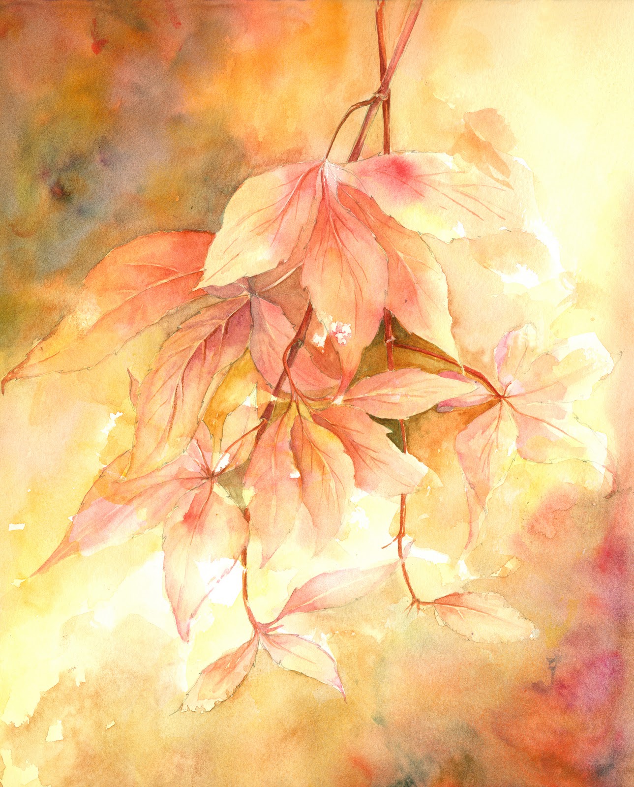
The first painting came about through my Art group. The subject was 'Clocks and Watches' Immediate thoughts were dandelion clocks, but I felt that this would not be totally in the spirit of the subject, so something mechanical had to be included! I am still a flower painter so .......how to combine the two! When I had finished the painting, I brought it home and added a number of cogs etc to the corners of the painting where I felt it lacked interest, so I had my first recent ( I say that as I have done some collage in the past) mixed media, including collage, painting and printing.
'Clocks' Mixed Media on Fabriano Extra White
(45cm x 35cm approx)
I then had a go at something a bit more radical! This time it was to be a painting of very free Marguerites and the background would be made up in part of some photos of Marguerites taken in the garden last summer.Then using acrylic ink, gouache and watercolour. I would paint in the flowers. Not as easy as it sounds. It was difficult to decide where to place the picture bits and how many to use, and in some ways was quite difficult to visualise how it was going to end. However, nothing tried, nothing gained, so I pressed ahead and at least managed to finish the painting.
Interesting to note that subsequent efforts have all ended up in the bin.....but I will keep trying from time to time between more traditional stuff which is within my comfort zone!
'Marguerites..Experiment' Mixed Media
Fabriano Extra White (35cm x 45cm)
What I need to resolve is the hard edge of the collage pieces. To get a really good reproduction, I have used a photographic mat paper and it is obviously much thicker than tissue or newspaper and therefore does not blend readily with the background support. The result is a series of hard edges which I would like to get rid of so they are less prominent in the finished work and blend more into the background. Any ideas anyone?
Hope you enjoy looking and may be you will be tempted to give it a go!
Monday, 23 January 2012
Friday, 13 January 2012
Realistic Abstracts
I was fortunate enough to receive a couple of art books for Christmas, and have enjoyed dipping into them both from time to time. The first is Realistic Abstracts by Kees Van Aalst, and the second one is Collage, Colour and Texture in Painting by Mike Bernard. From my perspective, they are, neither of them books for beginners, but are for artists who have mastered the basics and are ready to develop their paintings in a less than figurative way.
I am quite excited by the concepts in each of the books and have been ready for some time to try some new things. Kees Van Aalst's was the first one that I have really studied as I have been trying for some time to loosen up my paintings and to introduce a bit more freedom into the finished work.
I do not find it easy!! Even with the help of the text and the lovely examples given in the book, my finished results were still more realistic than abstract, but it is a start and I will persist!
Cherry Blossom
Delphiniums
In both paintings, I painted the background first, using a limited palette, leaving white where I thought it needed to be. It was easier to work from one of my photos at this stage as these highlights are easier to see on a photo. I then spent some time looking at the resultant sheet of colour, decided where the flowers were to go and did a very limited drawing to keep me on track.
Whilst painting the flowers and leaves, I tried to keep in mind that all I wanted was just a suggestion of flowers, leaving the imagination to fill in the rest.
Sad to say, that each painting is still too realistic for my intended goal, especially the cherry blossom, but maybe I am getting there. I do quite like the delphiniums! And it was really good fun!
I have had a go at a bit of collage from Mike Bernard's book, and this weeks subject at art club was 'Clocks and Watches'. Quite a challenge for a flower painter!! So I used some of the tips that I had picked up for the painting,and did a bit of collage in combination with the watercolour, but I will save that for the next blog.
Wednesday, 14 December 2011
Composition
As the Christmas season rapidly approaches, I have to think about closing down the studio and converting it into the guest bedroom. I have always known that the price to pay for having sole use of the second biggest bedroom for my studio has meant that whenever we have visitors, I have to give up the space whilst ever they are in residence. My mother is about to join us, so can see no possibility of doing much painting until the festivities are over.
I have, therefore been making a bit of a push to finish a piece of work which has been on the easel for over a week now, and that it quite a long time for me.
It was really coming along nicely, until there was enough work completed to be able to imagine the end result. Some bits of it are lovely, but I am sorry to say that the composition leaves quite a bit to be desired!
Now that it can be seen as a whole, it is almost a painting of two halves, which bothers me each time I look at it. My husband thinks I am too critical, but I do wish that I had arranged the flowers a little better and not followed my photograph quite so slavishly. In hindsight I would like to move the central yellow rose across to touch the spray of white roses on the left and slot another white rose between it and the lower right yellow rose.
I also wish that I had not had all 4 white roses on the left facing straight towards me. It would be more interesting if at least one of them was turned slightly away from centre.
I really must do a compositional, tonal sketch in future before I start, but I am always too keen to get on with the actual painting. Will I ever learn!
Friday, 9 December 2011
Only two more weeks to posting!
I have been so busy over the past couple of weeks, that I have given no thought to adding a new post to the blog spot. As the work has involved the production of my christmas cards, I thought I would share that with you.
The first task is to paint and produce our main christmas card. I need to have a good idea - in short supply after a number of years, and an inability to paint winter scenes - which then has to be executed and printed for about 100 recipients. Our friends are very supportive and are always keen to see what the current season will bring, which adds to the pressure. I usually paint it reasonably large, and then reduce it on the scanner using Abode Photoshop. I do not like cards which have their fold across the top, as they invariably do the splits in time for Christmas. I get my card from Halcyon Fine Art and he is able to supply an A5 landscape format card with the fold on the left hand side. There are lots of others to choose from, and they all come, if required with proper card envelopes with a diamond shaped flap.
This year's design is very simple.
In addition to the general card, I have 4 specials to make. I have 3 friends with whom I used to paint on a regular basis, but due to a variety of family reasons we are no longer able to do so. We have always, however, met together in the early part of December to swap gossip and wish each other well for the comming year. It became a tradition of the meeting that we would produce individual, hand painted cards for each other. I decided to stick to the same theme, and then had the great idea of using the original painting of the three pointsettia for these three individual ones.I carefully cut around the flowers, painted more holly and red petals and stuck them all together to make three three-D cards.
Now I was only left with the most special card. Every year I have produced a hand painted card for our daughter. She is always very appreciative, but no matter how hard she tries to tell me otherwise, I know when she does not like it, so I do always give it my all!
Sticking to the same theme, I have adapted the ideas fron the three Pointsettia, and produced something similar but more refined. I am encouraged by the fact that she really liked the general card, so am hopeful that the theme, at least will go down well!
I am really pleased with the result, although the photo does not do it justice. It is difficult to see the effect of all the individual petals and leaves which are raised above the surface of the card. I am sure she will love it. Of course all the special ones have bits sticking up on them, so there is no way they can go into envelopes. Better get some boxes made! A very Happy Christmas to you all.
Thursday, 10 November 2011
Contrasts
Whew! What a week of contrasts! Last Thursday at club it was a case of abstract art, and this week I have just finished a flower painting as traditional as you could get. It certainly makes for an interesting life.
Last weeks club subject was abstract music. I do enjoy thinking about this type of subject, but lots of the members find it incredibly difficult to disassociate themselves from figurative shapes. Hence most members finished the morning with either surreal paintings involving musical associations like bits of notes or instruments etc, or graphic patterns with similar motifs. My take on abstract art is that if you know what it represents, then its not abstract. Having such a passion for flowers, I chose the musical rhyme....'Lavenders Blue, Dilly Dilly, Lavender's Green' and I am delighted to say that everyone who was interested had to ask me what it was, and where was the musical link.
In point of fact, I was much better pleased with the result than I had hoped, and will certainly look forward to trying some other subjects as starting points. I put lots of emphasis on texture, and included the use of clingfilm,salt,splattering and blowing the paint around the picture as well as a bit of collage of circles cut with a hole punch. The paper was quite wet at certain points so I was glad to have used a good quality paper,and I included watercolour paint, acrylic inks and watercolour pencils to produce the colour.
300gm Fabriano Extrta White Not Paper with
mixed media 55cm x 45cm
A few weeks ago, I indulged in a few tubes of Daniel Smith watercolour paints, and one of the colours I chose was his 'Moonglow' which is marketed as a beautiful colour for creating shadows. Eager to try it out and see what it could do, I painted a cluster of lilac edged clematis. These flowers have very wrinkled edges to their petals, so lots of delicate shadows are needed to show this feature. I mixed tiny amounts of the flower colour ( Quinachridone Magenta ) with the Moonglow to paint all the leaf curls. Then strengthened the mix with a little more Moonglow to paint the very light cast shadows around the centres etc. I also used the Moonglow as part of the mix of Hookers Green. Prussian Blue, Windsor Green and Quinachridone Magenta to paint the background. In this painting I decided to limit the dark background to the centre of the painting and leave the edges pale. Hope you like the results!
Fabriano Artistico Rough Paper
Extra White 300gm 30cm x 45cm
Monday, 31 October 2011
Autumn Glory
The view from my studio window is truly glorious at the moment. There are 2 silver birch trees wearing their autumn foliage, with the silver bark showing through the loose branches. When the sun shines through them, especially in the early morning and it is low in the sky, the colours are mouth-watering.
On Thursday morning, the sun was out around noon, and as I came away from Art Club, the bonnet of my car was up against a tall hedge of muti-coloured shrubs which give us lots of foliage choice throughout the year if we need something of that sort for the still life painting. This week, there were the most beautiful end twigs of what I think is Virginia creeper. I,m not very good on trees and shrubs, but the name is not really important,
What was inspiring, was the way the sun shone on these leaves which were buttery cream in place and a beautiful pinky orange or magenta in others, often on the same leaf. I could not resist. A discreet clip here and there and the minute I got home I had paper and paint on the go, so afraid that they would wilt and die before I had done my best to capture them in a painting.
Once the drawing was done, I flooded the paper with Naples yellow and a mixture of Naples yellow and Quinachridone Magenta, leaving bits of white and being careful to keep both colours separate in places to maintain the freshness of the colours. I then took a rubber to the drawing to remove any pencil lines which were in the unpainted ares to give me some lost edges. Finally, I had a great time painting the leaves, strengthening the colours where necessary, darkening the background behind the leaves, and finally adding more colour to the top left and bottom right, to leave a highlighted passage diagonally across the middle! Over the years we have painted so many autumn subjects, but there is always old favourites to try again, and new exciting ideas to develop. I hope you enjoy looking at the painting. I am pleased enough to mount and frame it.
Watercolour on Centenaire 'not' paper
300 gm 30cm x 40cm
In addition to the Naples Yellow and Quinachridone Magenta, I also included Quinachridone Rust, Brown Madder, Nickel Quinachridone, Cadmium Orange, and Indigo in the background.
Thursday, 27 October 2011
Fashions in Flowers
I am frequently struck by the way flowers seem to go in and out of fashion, but seemingly they do.When I think of the pattern of sales over the past few years, it seems to support this premise. I suspect that those flowers shown frequently in gardening programmes and those chosen as star performers at the great gardening shows are bound to have their moment of glory, but there are definite trends apart from this. A number of years ago, lavender was all the rage and I sold almost everything I painted , this was followed by opium poppies, then wild flowers like buttercups and dandelions, then we had the sunflower, then the hellebores, then Iris.I've had a bit of a run on foxgloves as well. Now, I am hoping that it is the turn of the agapanthus.
I am besotted by these beautiful stately flowers and I love their gorgeous blue colour, especially the deep blue ones. I have never painted nor sold many blue studies, so maybe the time has come!
I have tried endlessly to grow these in my garden (together with delphiniums) but they do not like the soil. and although, from time to time, I get plenty of leaves, I have only ever had one fairly pathetic bloom.
Against my better judgement, I have just acquired a large pot planted with two varieties. For the time being I have left them in the pot to over winter, so they can be more easily protected. I have painted the flowers from this pot 3 times recently as I cannot be sure if they will flower again next year. I am ever optimistic!At the last exhibition, I sold the only one I had previously painted, and regretted it as soon as it left the building, so I now have the dilemma, about which one to keep and which to put up for sale in the next exhibition. Isn't life hard!!
I hope you enjoy looking at the three paintings and would be interested to know which you would keep, if any!
All three are painted on Fabriano Extra white 300 gm paper. I have as feeling that the 3rd one is suffering a bit of bad photography, and the colour rendering is not quite as good as it should be.
Subscribe to:
Posts (Atom)