Monday, 17 November 2014

Patty's Plum Poppies

 I cannot believe the weather we are having, and at a time when I would normally be putting the garden to bed for the winter, I have all sorts of summer flowers trying to re bud. I was amazed to find two fat oriental poppy buds, one of which has subsequently flowered, but been totally battered down by the wind and rain. Heaven knows what all this late growth will do to next years flowering season!

It did, however, put me in mind of some photos I collected of Patty's Plum poppies which I had not used for a painting, and being kept indoors by the continual rain, it seemed a good time to have a go.

One of my usual paper, Cornwall Matt, 600gm, and an initial wash of Quinachridone pink with a little Quinachridone Magenta, some Indigo and Apatite Green Genuine.


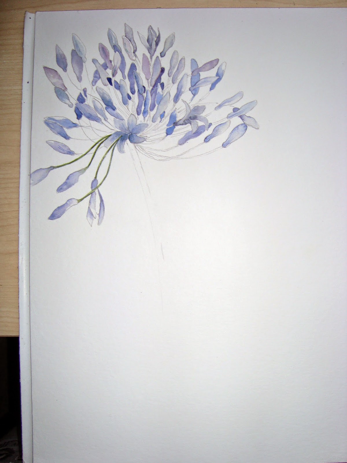
I let the wash dry completely, and then did a reasonably accurate pencil drawing of five poppies and some leaves.

There is not a lot more to say really. I painted in the flowers using the same colours as the top half of the background, being careful not to cover the pencil lines so that they could be removed later, and finished the painting by adding the greens.

I removed the pencil lines carefully at this stage.

I added some white acrylic gouache for the highlights and a little splatter and it was done.


It seems to work quite well, even though it is not really magical, as I would have loved it to be, but they cannot always turn out as well as we would hope, but I am satisfied. It looks very pretty with a mount and frame.

Monday, 10 November 2014

Rose Hips

In response to the title 'Leaves and Berries' I opted for the remains of some rose hips in the garden.

I started by applying a multi-coloured wash to a sheet of 'Cornwall' matt paper.
I wet some parts of the paper with a brush and the central part, I wet using a laundry spray.
The spray has the advantage of giving a textured look to the background as the paint runs along the linked spots of water.


You can see this lovely passage below the deepest area of Quinachridone Coral. I also used Teal Blue, Indigo, Sap Green, Translucent Orange and Quinachridone Rust.
I let the paint dry completely and then added a faint pencil drawing of the rose hips.I was careful to keep the central textured area as free from hips as possible as I really liked this part of the background.


I painted the hips, created some leaf shapes and added some twiggy forms for the stems. I kept the stems as natural as possible by blowing a small puddle of paint across the paper to give them natural shapes
I tried to vary the colour of the hips as much as possible, and left some only partially painted into the background.I erased any remaining visible pencil lines.


When all the hips were painted, I felt that the bottom three were in too much of a straight line, so I added a couple more to hopefully improve the composition.
I darkened the top LH corner and added to the bramble bits at the top. I decided that this was the point to stop. It is too easy to work dark areas into reds and get them 'dirty'. Even now it is not as fresh as I would have liked it, but I think it will do!

Sunday, 26 October 2014

Another go at Roses


The mild weather is playing tricks in my garden and some things are beginning to produce a second flourish! I have 2 large opium poppies ready to flower again which I have never seen before, but do not know if we will have enough sunshine to bring them fully open!
It also means that there are a number of roses out at the moment, two or three on each bush, so it seemed like a good time to have another go at painting them.

I started with one 'Peace' rose, which I photographed from various angles, and used these to make the initial drawing. I think I used mixtures of Yellow Ochre and Indian Yellow for the hearts and Opera Pink and Quinachridone pink for the flushed edges.


Using the same technique as so often described, I painted as close to the pencil line as possible and then erased it once the paint was totally dry.
I worked one flower at a time, adding bits of green and some background (this gave me the edges of the white petals ).


When all the flowers were painted and the leaves, buds and stems added, I put in a dark background of mainly Indigo and Ultra Marine, together with odd patches of the Quinachridone Magenta. I always try to put the colours of the subject into the background.
I then tried to lose some of the edges by adding washes of white Acrylic Gouache.


I am not really sure it worked, but I did enjoy doing it and whilst I had some roses I was determined to give it another go.

This time it was a couple of pink roses, but I put a wash on the paper before starting as I though this might be a better way of losing some of the edges and keeping the painting a bit freer.


When the background was dry ( Still Qinachridone Magenta and a little Opera Pink, being especially careful with the green as this will give dull colours if allowed to mix)

I then did the drawing and tried to work the roses into the patches of wash in the background.


Again, it was one flower at a time, and removing the pencil lines as I progressed.

When I had finished painting the flowers, I was not sure if I needed leaves and stems, so I will live with it a little while before deciding, but one thing for sure, I am really pleased with this one!!


Wednesday, 8 October 2014

Agapanthus

Time to have another go at these lovely flowers, which are still in bloom in Cornwall, even though we are well into October.

As things are a little less hectic, I have remembered to photograph each stage, so I hope you find the process interesting.

I wanted three flower heads but began with a drawing of only one, as this helped me to keep track of where all the stems would be and also did not restrict me to where flowers of the next one would overlap. The drawing was very simple and light to avoid too much pencil in the finished painting


I carefully painted in the flowers, trying to vary the depth and mix of colours, using Cobalt Blue, Ultramarine Blue and Quinachridone Magenta. I painted up to but not over pencil lines, and added free hand flowers where necessary to give me a nice dense middle.


I added a very small amount of stem so that I could decide later which one would be in front. I then added a pencil drawing of the second flower head, which I painted in the same way. before adding the third.


When all three flowers were complete, I painted in the stems and the golden bits of 'leaf' under each flower. When the painting was totally dry, I lightly erased any visible pencil marks.


I was really pleased with the painting thus far, but felt that it was a bit flat and wishy-washy, so I mixed up some slightly stronger paint and darkened quite a few of the flowers especially on the LH side, and added a darker wash over the LH side background including part of the first flower.
I had to do this really gently to avoid disturbing the under layer, which I had made sure was absolutely dry before proceeding.


I am sorry that the colours of each photo vary slightly, but I was painting during the evening and used flash on the camera, which is not always as accurate as daylight, but I think you can get the idea! The finished painting is somewhere in between the 4th and 5th photographs
The painting is done on 'Cornwall' Matt paper.


Wednesday, 24 September 2014

White Swan

Browsing through my resource folders, I came across this beautiful picture of a white swan. Although the subject seemed daunting, I could not resist having a go and putting all I had learned about the versatility of white Acrylic Gouache into practice!


I started on Hahnemuhle Matt paper...450g...as there was going to be lots of wet paint on the paper and I did not want it to buckle and have the paint run into the depressions and dry darker than the rest of the image. I did a fairly careful drawing of the head as this is the most important part. and gave myself just a brief outline of the whole body shape.


I was aware at this point that the beak and eye would be right in the centre of the painting, but was not sure how to get over this,so I at least made sure that it was  in the top third of the painting.

I painted the head, neck and beak in a quite figurative way and let it dry completely. I then added the background colours by wetting the paper and dropping in various pigments,including Indigo, Cobalt Blue and Quinachridone Magenta, allowing them to bleed freely into each other. I kept the top corners darker than the rest of the background, and kept it lighter around the feathers so that the white gouache did not have too much work to do covering dark areas.


I then simply built up passages of mostly yellow ochre for the underpainting and white acrylic gouache for the feather highlights. There was some Paynes Grey, Magenta and Indigo. The initial white areas had plenty of water as well as paint as this enables the gouache to be blended into the background, but it was obviously used neat to do the top feathers and the water droplets.

Before adding the final splashes, I darkened the areas around some parts of the bird to make the white areas stand out.

A very satisfying final splatter of white gouache and the painting was finished. It is not quite as vibrant as the original photo, but I think it does reflect my personal style of painting and I am very pleased with the result. I must do a few more animal paintings in the future!!


                                            'Swan'    26cm x 36cm watercolour inc. gouache


Friday, 12 September 2014

Elderberries : Limited Palette

We are back to the formal programme of subjects at AVA, which means no weekly hiding in subjects within our comfort zones. It was, however, a gentle beginning for us all as the only criteria was the use of a limited palette. This was described simply as two tubes, pans or sticks of  'paint'.

What was interesting about this subject was the need to begin with a subject that could be well described using only the two pigments, and then to explore the palette to try top find two pigments that could give you the greatest range of possibilities.

The first consideration was resolved, thanks to a neighbours  beautiful Sambuca Nigra bush on the border of our two gardens. The leaves and berries are not dissimilar to each other in colour and they lent themselves to a bit of artistic licence.


Having settled on the source material, I then had a good look at the possible pigments. I needed a rich burgandy for the berries and something which when mixed with the red gave me some lovely darks as well. In the end, after a bit of trial and error I selected Quinachridone Magenta and Pthalo Green.


I chose a sheet of 450g paper as I knew there would be plenty of water with the initial wash, and I have been having problems with buckling recently.The paper is  Cornwall Matt by Hahnemuhle which is becomming one of my favourite papers at the moment.

I sprayed the paper with plenty of water, using the spray can give nice textures when the paint is dropped in, as you can see with the green in the top LH corner.
I dropped in paint selectively but at random into the water and tried to create a few darks in the middle. When the wash was dry, I was a bit disappointed that there was not too much pure magenta left, but the paper is too expensive to waste, so I had to carry on. Whilst it was still wet, I used a straw to blow a few random twiggy shapes out of the base of the painting. I find this helps to keep the work a bit loose.


When the wash was dry, I simply painted in the berries and twigs and identified the leaves by using their negative shapes. As I could only use two tubes of paint, I could not get back the highlights in the berries which was a bit of a problem. In hindsight, I should have put tiny drops of masking fluid on the paper before doing the wash and this would have given me some hightlights. I tried to leave paler patches where possible and deliberately painted berries in the white paper patches to give really fresh colour and bright white highlights.I also added a little white acrylic gouache to some of the berries on returning home!


Because I did no drawing, I did not get quite right the way the stems grow from the main branches, so it cannot be described as a botanical painting, but I am quite pleased with the result. It does show what a lovely range of lights through to very darks that you can get with just two tubes of paint!

Friday, 5 September 2014

Sorrel and Honesty

Along the same back lane where I picked the blackberries for the previous post, there has been lots of sorrel in the hedgerow. When the sun shone it was the most glorious colour and I could not resist clipping a couple of pieces to bring back into the studio.


I also had some new sprigs of honesty, so decided to combine the two, as this would enable me to use lots of my favourite colours.


                                                                  Sorrel And Honesty
                                                      Fabriano Artistico 300g Rough paper

The paints include Indigo, Teal Blue, Paynes Grey, Quinachridone Rust, Transluscent Orange and Yellow Ochre. I also used white Acrylic Gouacheon the honesty and for the splatter.