Thursday, 31 January 2013

Winters Scene

There were 19 of us at Avon Valley Artists this morning, and it was great to see so many interpretations of the subject. There were some lovely traditional landscapes with a variety of different colour renderings of sky and land. After the recent weather, there was plenty of snow!
I used one of the photos taken in the garden of sturdy twigs bowed down with the weight of the snow as my starting point.


The idea was to paint the snow with bits of berries or rose hips peeping from under it, with perhaps a couple of snow laden leaves as well.

How difficult was that! I had to paint the twigs, hips and leaves first and then add the snow.

I painted in the twigs by puddling a pool of paint in the top RH corner of the paper and then dispersing it by blowing at it through a straw. I always think this process gives very realistic twigs.

I then painted in the hips, doing the minimum of drawing, not worrying too much if the colour did not hide some of the stalks as I knew these could be covered with snow later.
Finally using the AV Acrylic white gouache I painted in the snow, first making it blend with the underpainting to give the shadowy colours and then adding crisp white when it was totally dry.

I used a toothbrush and the spatula to splatter both a fine spray and some more dense blobs, and I added a few red splatters in the lower half of the painting.

Although, as usual, I totally enjoyed the experiment, I did find it quite hard to interpret the bulk of freshly fallen snow so close up!


'Snow Covered Rose Hips'
30 x 22 cm

Fabriano Artistico 300g 'Not' paper

Saturday, 26 January 2013

Coffee Time

After the euphoria of finishing the  'Teasels' painting it was back to more mundane things and Avon Valley Artists subject of the week, which was 'Coffee Time'
I really did want a bit of a change and frequently use these sessions to do a bit of experimental work. Sometimes it succeeds and sometimes it is not what I am after but worth trying out.
As I was a bit stuck for good ideas, I decided to try something a bit more modern maybe, and create a composition based on a painting which used to hang in my daughters first flat. It was a very simple composition of a cup and a jug very close up with only half of each visible and in white and pale blue only.

I kept the idea of a limited palette, but chose a coffee pot to fit the subject critera and a blue and white mug and orange plate in the background.
It is a square , which is not such a good idea as square frames are hard to come by and so expensive to have made, but I decided to go along with it as I was sure it would not be good enough to frame anyway, and using a square format is all part of the experiment.

I did the drawing, outlines only, and then washed colour over most of the paper, leaving small areas of white, but very few, and added a bit of salt for background texture.
Using the limited palette,Cadmium Blue, Ultra marine Blue, Moonglow, a little Quinachridone Magenta, Paynes Grey and Translucent Orange I painted in the images. I used pure paint for the very dark areas and Acrylic Gouache white for the highlights.
I think it worked better than expected, but before I can mount it, I will have to flatten it, as it was not stretched, and has not dried totally flat. I do this by generously spraying the reverse side of the paper and then allowing it to dry between two pieces of MDF, with the painting protected from the boards with white paper. I am always afraid that the damp wood will bleed colour into the painting.This process always works very well.


'Coffee Pot and Mug'

One of the other members was painting from the gorgeous photograph below, taken I believe in Morrocco, and I thought I would love to have a go at painting it.
She was very happy to lend me the image so when I returned home, I set to, to give it a go.


I was not absolutely sure who took the photo, so whilst doing a fairly detailed drawing, I gave some thought to how I should make it my own. I wanted to get those lovely deep glowing dark jewel colours to give it a Persian feel, so I decided to change the background colours, and I thought the balance would be better by the addition of another pot. In hindsight, I think this may have been a mistake, but I would have ended up with another square format painting!

After the drawing I proceeded as usual, washing lots of colours into the background, but trying to avoid the pots, as I wanted them to be quite fresh in the finished painting. I textured the background and when all this was dry, I painted in the objects using the colours from the background.
I finally put several washes over the background because I felt it was not dark enough, and am still not sure if it could not go even darker on the LH side.

The finished painting does not 'glow' as I would have liked it to do, but some areas are quite pleasing to my mind, and I will take a copy of the photo, and maybe have another go at a later date. Like all club sessions, one of the most interesting parts is the way in which we see how members interpret the subject, and these two ideas could not be more different!


'Persian Pots'

Wednesday, 23 January 2013

Teasels

With all the world around me covered in snow, there was not much chance of finding the odd flower in the garden to bring indoors, although there are Camellias out and the Rhododendrons and Hellebores are almost there. So if I was to start a painting it was a choice of either use a photo or paint something from the studio. I have a pot of dried seed heads, including a couple of Teasels which I thought might do, although they did not look too inspiring in the pot before I started!!


I chose a block of rough Fabriano Artistico Extra white, and did a quite free sketch of a bunch of teasels, and using masking fluid, covered the sharp needles around the head of each one, together with the longer dried leaves which went into the background.
This meant that I could freely and confidently wash in the background with as many colours as I needed without having to be careful about the seed heads.


This painting was to be all about colour, as free as possible and very little concern about getting them botanically accurate. As you can see from the initial washes I chose lots of Blue/green colours together with some of the earth colour I proposed using for the seed heads.

 For all of us, there hopefully comes a time when the beginnings of a painting really excite us. What a glorious feeling! As the colours went down on the paper, it was enough to really excite me and I could hardly control my impatience to get on with it BUT I had added plenty of granulation fluid and areas of sea salt to give the background texture, so I had to wait until it was completely dry so that I could remove the masking fluid without smudging the background texture.
When the paint and salt were dry, and I had carefully removed them, together with the masking fluid around the seed heads ( I left the long dried leaves at this stage so that once again the heads could be painted with abandon) I painted each of the heads, using Yellow Ochre, Quinachridone Rust, Translucent Orange, Indian Yellow and Burnt Umber. Where necessary I added a little Moonglow or Ultramarine Blue in the darks.

I removed the rest of the masking fluid and painted in the needles and the dried leaves, using a little White Acrylic Gouache for the detail. I darkened parts of the stems, then gave the painting a good but delicate splatter with Burnt Umber, Translucent Orange and White Acrylic Gouache.


All that I have done to the painting since taking the photo is to soften the divide between the half painted teasel on the left and its background. I just felt the line was a bit harsh. Apart from that it is as I painted it without a break, and without too much else other than instinct. I know art is subjective and this image might not be to everyone's taste, but just for once I an totally delighted with the result and think it is my most  successful painting for month. I now have to come down off the high and get ready for the Club exercise tomorrow which I am sure will, by comparison be a total disaster!

Monday, 21 January 2013

Paints and things


I talk so often about the colours I use, and I am aware that lots of them do not have the old traditional names that so many of us are used to. So I thought it might be interesting to have a brief look at my palette, and how I have organised it, so that it might seem a little clearer. I also thought I might let you know about my brushes and a few other products that I am never without. So lets start with the palette.


Quite some years ago, the government was sponsoring further education for the  'less young' members of society (if my memory serves me right). And with some voucher system there were several options from which to chose. A couple of friends and I selected the Michael Wilcox system of paint mixing which came with this plastic palette which I never got around to using as it was meant to be used. Having a clear-out several months ago, I came across it and thought what an ideal palette for all the new modern colours I am now using more and more. It enables me to have at least 33 pigments in the tray, and that is lovely for flower painting, as it avoids too much mixing. The colours I favour most are in the bigger inner pans and the less used ones are in the outer ring. I have also used the corner triangles to have test blobs of new colours from Peter who is very generous with his paints. I really intend to keep these and the inner triangles for mixing. What I really like about this tray is the size of the wells. I can easily add water to the well and get brushfuls of rich colour, but which quite happily dry out quite quickly.I don't use the Michael Wilcox system at all, although I understand it can be very successful, but it seems a bit like painting by number, although I understand it has been very scientifically developed. Because of the number of colours with very different names, I do need a colour chart.


I, therefore drew out a circle on cheap watercolour paper, the size of the inner circle, and painted a swatch of each colour together with the name of the pigment and the supplier, so I would know where to get replacememens, and people often ask me whose colour one of them might be. Its also easier when writing my blog etc.
I have photographed this in two halves in the hope that you can read the writing if you enlarge the photo, should you be curious about any of the colours. This circle has now been stuck onto the clear plastic lid and the chart matches the colours in the palette.
The manufacturers are as follows:
WN is Winsor and Newton
G is M Graham
DS is Daniel Smith
DR is Daler Rowney
M is Maimeri
SMK is Schminke


As for the rest, I use Pro Arte synthetic brushes from the 007 series, some of which I buy as seconds from art fairs. I do have some sable brushes but rarely use them as they are too soft for me. Just occasionally I will use a biggish one for a wash as they hold much more paint.

I always use Fabriano Artistico Extra White paper, either Rough or Not in 2 sizes on pasted blocks. 30x45cm or 35x51cmand it is usually 300g in weight I have been a bit disappointed of late with regards to the blocks as they seem to come apart with amazing ease, and I have had to stretch some pieces onto a board, which defeats the object of having a block.

As for the rest, I use blue Pebeo Masking Fluid, Granulation Fluid, Indian Ink, Acrylic Gouache,and a small spray bottle of clean water containing a few drops of ox gall to soften the paints before I start.

Obviously there are lots of other bits and pieces but those are the most important 'ingredients,!

I prefer the Acrylic Gouache to the chinese white watercolour or the ordinary gouache as it is has a lovely creamy consistency, very white and bleeds beautifully when dropped into wet washes. I use it a lot!

I did begin by saying.....a brief look at......... I hope I have not gone on too long!

Thursday, 17 January 2013

Cockerel

Avon Valley Artists subject this week was 'Animals'  We were free to chose what creature we liked (Sometimes we are given a photo unseen and we all paint the same image....a very interesting exercise!)
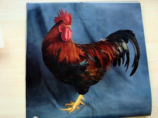
My piano teacher keeps chickens and has had an amazing calendar of prize chickens on her wall all year, which she promised to save for me, and as she gave it to me last week, I thought I would attempt to paint this proud and gloriously coloured cockerel.


I decided to work on my biggest block of Fabriano Artistico Extra White 300g paper, but discovered that on the block in use, there were only 2 pieces left and they had become detached from the cardboard backing. As I intended to use some fair quantities of water and wet-in-wet, for the background which I was going to paint first, I separated the two sheets and stretched one of them in the traditional way onto a piece of MDF board. I did not want the paper to buckle and result in the washes filling the undulations to leave the background streaky. Even with stretching, the paper sometimes buckles whilst very wet, so I needed to keep a close eye on the paint, but at least it becomes taut again on drying.

I then mixed up a background wash, keeping it fairly pale so that the strong colours of the cockerel would be contrasted against it, and let it dry. I then drew the cockerel together with a bit of imaginative background, and had a go at painting him. Not easy to paint feathers without getting in to too much detail, but I did my best and was able to use some of the lovely orange and brown that Peter talked about in his recent blog (www.watercolourfanatic.blogspot.com) He was once again generous to give me a blob of the Translucent Brown which he has recently acquired. It gave some lovely granulated under-belly tones.


The blue tail feathers used the darkest of blues....Anthraquinone Blue by Graham and Paynes Grey, and the turquoise bits in the middle are Cobalt Teal Blue from Daniel Smith.

Saturday, 12 January 2013

Patty's Plum Poppies

I am never sure how paintings are going to turn out as I sit in front of the blank piece of paper, but I never thought I would find it so difficult to paint something - poppies- that I have painted endlessly before!. It is not the shape but the colour which presented the problems.
I have this photo in my resource folder and have been promising myself a go at it for some time. The time seemed right.


They are glorious flowers, and I had already decided to wash in a background before doing the drawing and painting the blooms. I mixed up a puddle of colour using Quinachridone Magenta, Alizarine Crimson and Ultramarine Blue which I thought matched the flowers very well. I painted this onto wet Fabriano Artistico Extra white 300gm paper, covering the top half of the sheet, leaving some white areas and I added some greens for the foliage lower down the sheet.


As you can see, I placed the plum colour where I thought the flower heads would be and made sure the greens were placed in vaguely upright leaf shapes.

I then lightly drew in the flowers and foliage around the heads of the flowers, and even at this point, I began to have vague thoughts about painting in fresh greens on top of the plum coloured wash, as this type of poppy has leaves growing immediately out of the stem right under the flower head.


The problem with painting the flowers and leaves was that the original wash is quite a dull colour, as the title 'plum' would suggest and when it was mixed in the palette it is a tertiary (at least) colour, which makes the addition of other colours on top move towards the inevitable grey sludge!
I did use white acrylic gouache for the highlights, but couldn't get any exciting colour for the petals using it in combination with the pinks. Hence the petals have lost that lovely translucent colout that hey should have.

I had gone far enough not to give up, but the painting does seem a little sombre by comparison to last weeks 'Iris', but them maybe the flowers are like that. I don't know. I will leave you to decide.


Now I look at the end result, I wonder if I should have varied the levels of the front three flowers!


Also this week, the subject at AVA was Doors, Windows and Gates. I chose to paint a door of a cottage in Boughton-On-The-Water which was overhung with a Clematis.


Same paper as always and usual palette. Trying to get all that greenery looking real was fun!

Sunday, 6 January 2013

Another Iris

These lovely flowers continue to draw me with their beautiful colours and markings, and so much praise must go to Clay Perry who photographs them with a truly magical approach. The photo used as source material for this painting comes from the  book simply called 'Iris' by Claire Austin, in which Clay has produced all the photographs.


                                                  'Sweet musette'

I reverted back to a previous way of painting, by doing the drawing and painting the flower first and adding the background later. I am not sure why I did this, but regret it in that the painting immediately tightened up. Something I have been trying to avoid recently.

I am sorry there are no 'stages' to share with you, but for some reason the photos got deleted from the camera card! The vagaries of modern technology or just my incompetence!


                                                   Fabriano Extra White 'Rough' paper
                                                   Watercolour with Acrylic Gouache
                                                                28cm x 38cm


As a complete contrast, this week's subject at Avon Valley Artist's Group was 'Sweets and Cakes'


Great fun to do as it enabled me to use pure colour and some of the pigments in my palette that I do not get to use too often. I wish I had remembered to take my Indian Ink with me as I would have liked the background to be really black. There is time for me to go over it as I will not be framing it, but it might find its way into the bargain browser in the exhibition!