Saturday, 19 October 2013

Glass Exercise

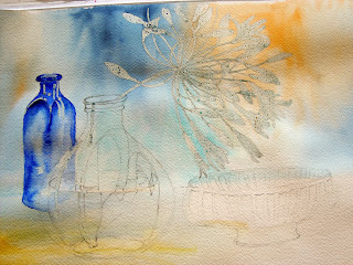
At Avon Valley Art Group this week, the subject was 'Glass'. I thought about what I could attempt, knowing that the 'glass' part of the painting would be quite demanding, but wanting to make as good a finished painting as possible.
I borrowed a couple of glass bottles from a friend and looked out a glass bowl from among my many props and decided to add a large flower head to the painting. I think, sub-consciously, I hoped this might detract from any deficiencies in the painting of the glass.

I have been very busy this week doing painting of a different kind in our lounge, but I made sure that I found the time to do as reasonable a drawing as possible.


I wanted to be able to add the background wash reasonably easily, so I blocked out the Agapanthus flowers with Pebeo Drawing Gum, using a 'Shaper Maker' instead of a brush. This was quicker and gave more even shapes. I also used the gum to retain the highlights on the glass, although I knew that when I got to the group the following morning, the light would be completely different.
I was also anxious to complete enough of the painting, to enable me to remove the gum asap as I did not want it to spoil the surface of the paper.


I painted in the background wash, making sure that there were shades of blue behind the LH bottle, which I then added, making sure that some of the colour was visible behind the central shape.


Next, it was time to add the stem and leaves inside the bottle in the foreground, and when they were dry, I painted in the pale glass, and tried to give an impression of water. I had spent some time in the studio, the previous evening, working out what these elements would look like, by placing a random twig with leaves from the garden, in a jar of water!( I was painting the flowers from memory)
I also began to add detail to the RH bowl. I then began to remove the gum a little at a time, to paint in the flowers. I did this gradually, as in removing the gum, the pencil drawing is also removed. I wanted to try to remember which flowers and stems were forwards or backwards in the composition, and by doing it a bit at a time, I was able to do this.


I finally added a bit more strength to the background, trying to get it to show through the glass without darkening it too much. The final painting seems a bit lacking in my usual contrasts of light and dark, but its ok.
At our 'end-of-session' viewing of the group's work we all agreed that painting glass objects successfully, is a difficult task, as there are so many elements to bring together, but members seem to enjoy being set a challenge, so I am sure it will appear on the programme again.

Monday, 14 October 2013

Trees : experimental

This week at AVA we had a chance to experiment instead of subject-specific painting! The brief was to produce an image in a wet medium without using any of the traditional tools to apply the paint. A brush could be used to mix the paints and a pencil could be used for an initial drawing if required. After that it was a case of looking around to find ways of putting paint on paper. This could include finger painting, sponges, dropper washing, twigs, paper or printing with odd shaped objects.

It seems that the members must have liked the idea as there was a good turn out, and some interesting work was produced.

I opted to paint a simple landscape without any preliminary drawing, and as it was going to be a hit or miss affair, I chose to use up some paper that I would not mind spoiling or abandoning. I used a piece of Hahnemuhle 'Cornwall' 450g paper. this paper is very white and has a very distinct hessian-like grid to it.

I did regret the paper to start with as it was very poor at taking the initial washes and it was at this point that I regretted most the lack of a big brush!

Not to be daunted, I mixed up some indigo wash which I dropped into the LH bottom corner using a plastic dropper, and blew the resultant puddle across the paper using a straw. This created a reasonable series of twig like shapes across the page, which instantly suggested a row of trees.
The rest of the painting was produced by adding pigment using a stick of Forsythia which had been sharpened in a large pencil sharpener, and a piece of diagonally trimmed bamboo. Areas of paint which needed a more wash-like finish were added with a cotton bud dipped in paint.


I am really pleased with the effects created in the painting, helped by the texture of the paper. I wish I had made the grasses to the right of the path less turquoise by adding magenta to the mix to pick up the same colours as the LH tree, but apart from that, as a brushless painting, I think it works ok. And as usual, doing this sort of experimental work is great fun!


Wednesday, 9 October 2013

Teasels

Making the most of what is around at the moment, I have had another go at a bunch of teasels. I love their curly dried sepals (?) and their spikes.

I only had a couple, but they are quite standard in shape so I used my imagination to compose the group. I did have a photo of the original drawing, but transferring the photos from the camera card to Photoshop, it got deleted, so sorry about that.

Once the drawing was complete, I used masking fluid to protect the spikes and the sepals, as I wanted to be fairly free with the initial wash. I really do prefer Pebeo's Drawing Gum to all of the others. It is the most free-flowing of the rest that I have tried, and works well in my drawing pen, which I use for applying very fine lines like stamens and spikes. It is also good in that it has a light blue colour, so you can see where you have put it. I also masked out the stems at this point. It is a good idea to test the masking fluid on the paper before committing it to the actual painting. If the masking fluid is to stay in place for any time,  I have found that the gum can remove the surface of the paper. This seems to happen especially with light weight or cheap papers.


 When the gum was completely dry, I washed the whole of the background with Transparent Orange   (Schminke), Cobalt Teal Blue ( Daniel Smith ) and Indigo ( Daniel; Smith). I was careful not to paint inside the teasel shapes. I then added sea salt into parts of the background, to be used to create some more hedgerow type stuff behind the teasels.

The painting had to be left over night to allow the salt to dry thoroughly, hence the need to test the gum. The larger pieces of sea salt take a surprising amount of time to dry, and because they absorb quite large quantities of paint, some quite pale areas can appear around the salt, with some quite dark areas where the salt has been sat.

When all was dry, I brushed away the salt and removed the gum. Using mainly Yellow Ochre, Quinachridone Rust (Both by Graham ) and Burnt Umber ( Daniel Smith ) I painted in the teasels.


I used white Acrylic Ink and Acrylic Gouache to add form to the seed heads in the background and to highlight some of the spikes. I also added a little bit of form to the base of the teasels from where each spike grows.


All that was left to do was to add a few darks to the stems and the base of each seed head and a gentle spatter of Cobalt Teal Blue and White Acrylic Gouache, and it seems finished.
As usual, I will live with it for a while before mounting, in case anything seems to need adjusting.

                                                                             
                                                                           'Teasels'
                                      Watercolour on Fabriano Artistico Extra White 300g Rough

Monday, 7 October 2013

Last of the Apricot Roses

The garden is responding to the lovely weather we have had over the past few days, and the last of the roses have opened and are beautiful. I thought I would take advantage of them and continue to address the problem of shadows, which I still feel I have not really got right yet.

I drew out a relatively simple drawing of three of the roses, adjusting their positions, as I did not want to bring them indoors, so did the drawing from the studio window.
I painted the petals of all three roses first using almost nothing other than Transluscent Orange with the occassional addition of Cobalt Teal Blue. At this stage, progress seemed ok and the composition and accuracy of the flower heads was fine. I had remembered to avoid painting over the pencil line so that I could remove them at this stage.

I then started to paint in the dark areas of the background using mainly mixtures of Indigo, Quinachridone Rust and Apatite Green. I kept it really dark in the top LH corner, add gradually added more water as I came around the LH edge. I painted the RH side with transluscent Orange to try to get the lost edges I wanted from the RH rose.


This photo may not look too bad, but the original painting, at this point, looks pale, insipid and in all honesty, a bit flat.I wanted the flowers to have more of the 'umph' they would have in the sunshine. I know this is achieved by the strong contrast between the lights and darks. I can see that there are still plenty of lights but it is sadly lacking in the strong darks.
Working on the premise that the cast shadows are just a darker version of the petal colour, I mixed some strong Transluscent Orange with a little Quinachridone Rust and with trepidation added it to various parts of the painting on the LH side of each flower.
Now I think the shadows have become quite muddy and  I would love them to look fresher and less overworked, so I will need to keep trying with other combinations to see what I can produce.

See what you think.


                               Usual Fabriano Artistico paper, with mainly Daniel Smith paints

Thursday, 3 October 2013

Seed Heads

This weeks title at AVA was seed heads. We had a lovely variety of subjects among the group and I have a pot full of dried seed heads in the studio from which I  prepared a drawing and initial wash of some Chinese Lanterns and some dried Honesty.


In my pursuit of a bit more of a loose approach to my painting, I tried not to spend too much time on each element, just trying to keep the paint relatively fresh and to just make a painting sketch of the group.


By this time I was really pleased with the colour and shape of the Chinese Lanterns, but struggled much more with the twigs of Honesty..I did think of leaving it at this point and looking on it as a simple unfinished exercise, but I felt there were still too many unfinished shapes to justify this. I kept going in the hope that something reasonable would emerge at the end of the session.


I used a sepia, non-permanent fine liner to give a bit of definition to the shapes, and then washed clear water over the pen to cause it to bleed a little.....this makes it less of a harsh line.
I think maybe that all the honesty pods are a little too evenly painted, so I may paint out some lost edges, maybe using white acrylic onto a wet surface, but I will live with it for a few days before deciding if it is worth the effort. I also added a little Cobalt Teal Blue to the LH background on the advice of Peter, and I think he was right to suggest it, as the Teal Blue and Transluscent Orange go really well together.

As a postscript, I think I do find the mid painting more attractive!