This week at Avon Valley Artists Group it was time for those who wanted to, to prepare for christmas. I always try to prepare my daughter's christmas card during this session, but I have to admit that I am beginning to run out of ideas. She, unfortunately for me, keeps them all, or I might be tempted to look up the old records and adapt some of those from earlier times. I think I paint a little better now.
However, the task had to be faced and putting up the christmas decorations this week, I thought I might try to replicate the garland that hangs above the mantle piece.
I began by measuring out a piece of paper the size of my card envelopes, doubled its width and folded it in half, to ensure the painting went on the correct half. I could do just a simple painting and then mount it on card, but I thought it might end up a bit heavy.
I started by applying a green and yellowish wash to the paper to sort of suit the holly, ivy and greenery I intended to use.
Using a pair of compasses, I drew a circle very faintly in the middle of the painted paper.
I then began filling in the circle with holly,ivy and evergreen sprigs.
When the circle was complete, I painted two scraps of paper with some green and greenish-yellow paint to use as extra leaves to be applied 3D to the card.
I drew simple holly leaves on the dark green, and ivy leaves on the paler section and carefully cut around them. I then glued these leaves at random around the circle and added red circles cut using a hole punch from red painted paper. I lightly sprayed it with white acrylic gouache on a tooth brush to create very fine spatter, and added a highlight to the red circles.
I then printed a Season's Greetings label to stick on the bottom.
The label does not look quite straight, but in fact, it is. The water colour paper has buckled slightly and the label stands proud of the painting, so it looks odd in the photo. I only wish I had used a capital G on the label!
Because of the 3D nature of the card, I then had to create a box into which to put it. It was worth the trouble because I am sure she liked it when she opened it. One more job I can now tick off of the list!!
Thursday, 12 December 2013
Saturday, 7 December 2013
Scabious
After having spent quite a lot of time on tight precise images.....the butterflies and my daughter's Christmas card (which I will show you in a later post)........ I had the urge to paint something bold and free. I have a bunch of artificial flowers in the conservatory which it has never occurred to me before to use as subject matter. I love the very dark blue in some of the flowers and decided they were worth a go. Sorry....the photo does not do them justice!
The point of this exercise was to loosen up, so I decided that there would be no drawing at all in this painting.Nor was I concerned about producing a recognisable type of flower.
I simply wet the paper and dropped colour onto the sheet where I thought the flowers might be, adding greens below to suggest the stems and leaf positions
Without any drawing I began to do the flowers, working around the central area of each, which I had blotted out with a bit of tissue, whilst the wash was still damp.
I am a little disappointed with the flower on the lower right edge, but as a quick and spontaneous exercise, I am quite pleased with it. I might not have posted it except for one part of the painting which I really love and I thought you might like to know how I achieved it, if you haven't happened on it by accident already.
I really love the way the paint has travelled across the paper in little zig-zaggy lines almost as if the paint is granulating. At first I was not sure what I had done. Then I realised that I had wet the paper by spraying the surface. Hence, the paper was covered in tiny droplets of water and the paint ran through the drops but failed to cover the dry areas. What a lovely textural passage....I will definitely use that trick again.
Tuesday, 3 December 2013
Butterflies
This weeks subject at Avon Valley Artists was Birds and Butterflies.
I have a book of butterfly photos and on browsing through it, came across a photo of a huge swarm of Monarch butterflies, sunning themselves on some warm rocks.
I thought it might make a lovely pattern painting.
From 'Butterflies' By David Badger and Brian Kenny
I had no intention of making exact drawings of each butterfly, and was not even concerned about them being true monarchs. I just wanted to have a go at producing a fresh attractive painting where the subject was obviously butterflies, but nothing specific.
I liked the way there were lots of different shapes, plenty of white and that lovely rich orange colour. I instantly thought of using Transparent Orange and Pthalo and Cobalt Teal blues for the background.
The process was simple. I drew out the shapes using first a pencil and then a fine black liner pen. I then washed over the shapes with the Transparent Orange, leaving plenty of white. Large areas of black were painted in Indian Ink.
I used the two blues and some Quinachridone Rust for the background, and that was about all. Two points to make:
1. It took ages to do the drawings and I was quite bored with the whole thing by the time I got to the end of the pen drawing, and in places I got quite careless. It needs patience!
2. I had various pens on the table at the time, and did not realise that I had picked up a non permanent one for a small part of the drawing and so when I added the wash, the black lines bled into the wet paint.I need to be more careful!
'Butterflies' (unknown paper)
I have a book of butterfly photos and on browsing through it, came across a photo of a huge swarm of Monarch butterflies, sunning themselves on some warm rocks.
I thought it might make a lovely pattern painting.
From 'Butterflies' By David Badger and Brian Kenny
I had no intention of making exact drawings of each butterfly, and was not even concerned about them being true monarchs. I just wanted to have a go at producing a fresh attractive painting where the subject was obviously butterflies, but nothing specific.
I liked the way there were lots of different shapes, plenty of white and that lovely rich orange colour. I instantly thought of using Transparent Orange and Pthalo and Cobalt Teal blues for the background.
The process was simple. I drew out the shapes using first a pencil and then a fine black liner pen. I then washed over the shapes with the Transparent Orange, leaving plenty of white. Large areas of black were painted in Indian Ink.
I used the two blues and some Quinachridone Rust for the background, and that was about all. Two points to make:
1. It took ages to do the drawings and I was quite bored with the whole thing by the time I got to the end of the pen drawing, and in places I got quite careless. It needs patience!
2. I had various pens on the table at the time, and did not realise that I had picked up a non permanent one for a small part of the drawing and so when I added the wash, the black lines bled into the wet paint.I need to be more careful!
'Butterflies' (unknown paper)
Sunday, 24 November 2013
Portraits At AVA
I am writing this post in the spirit of 'warts and all'. This week at AVA we were painting portraits. Is there anything further outside my comfort zone than people or animals, especially when a likeness is required! I confess to not having a clue what I was about, but disciplined myself to look at the chosen image as just another set of shapes. Getting a likeness was not within my aspirations.....I just wanted a painting that looked reasonably like a human being.
I did have a quick look at some of the paintings in a book called 'The Figure In Watercolour: Simple, Fast And Focused' which is a lovely book for starting from, if you want to have a go at painting people.
I tried to keep the subject simple and the colours low key in the hope that any mistakes would not jump off the page, but I do apologise to Dave.. my daughters partner..for making him much less handsome that he really is!!
Thank goodness that is over for another year!
I did have a quick look at some of the paintings in a book called 'The Figure In Watercolour: Simple, Fast And Focused' which is a lovely book for starting from, if you want to have a go at painting people.
I tried to keep the subject simple and the colours low key in the hope that any mistakes would not jump off the page, but I do apologise to Dave.. my daughters partner..for making him much less handsome that he really is!!
Thank goodness that is over for another year!
Sunday, 17 November 2013
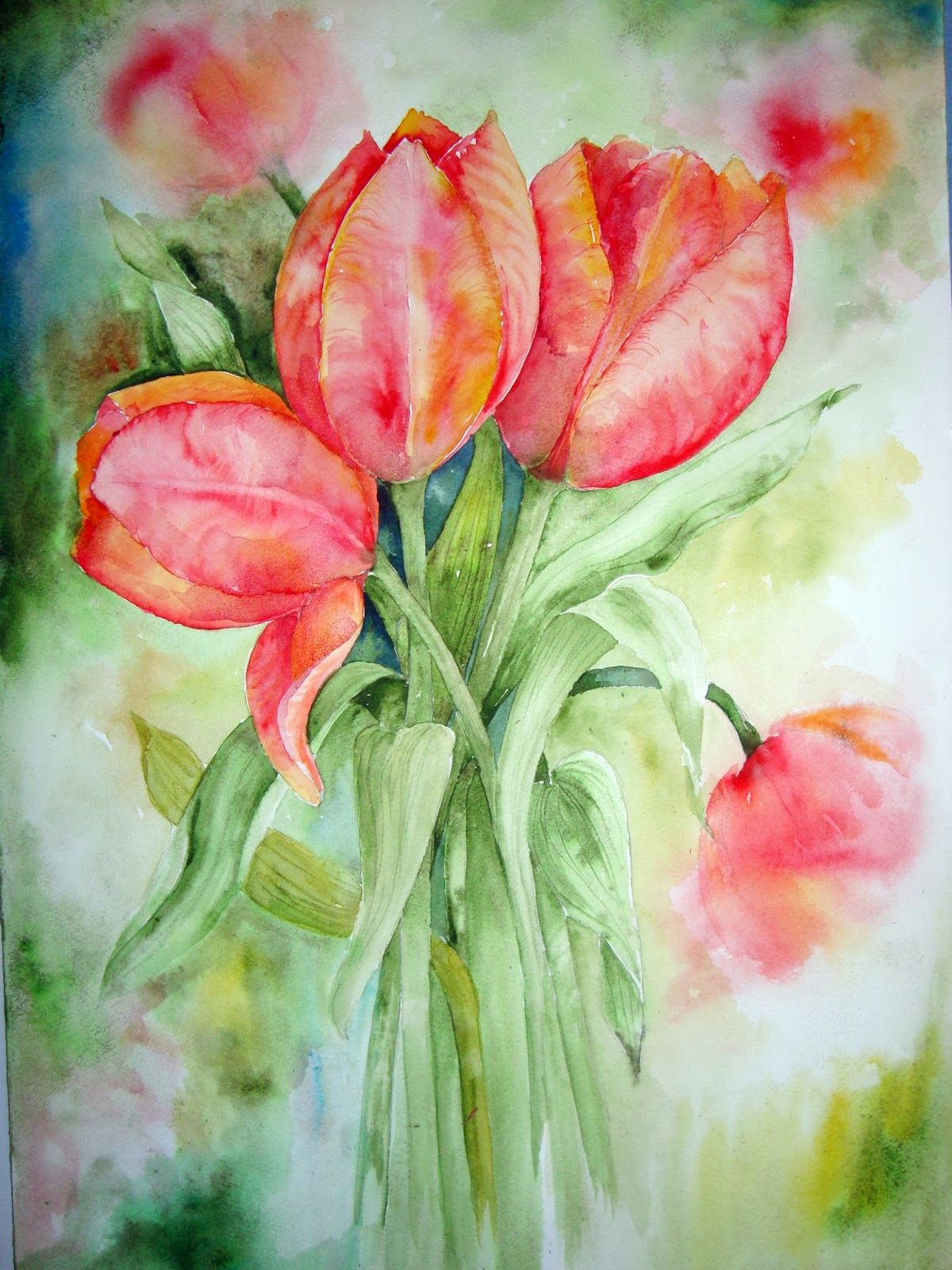
Red Tulips
I must have a subconscious desire to bring a little warmth into the house now that winter seems to be fast approaching, and so have a bit of a 'thing' going on with red!
I came across a photo taken taken by a guy called Clay Perry in a book on tulips. He is a great flower photographer and any gardening books with his name given as the photographer always finds it way to my bookshelf! I had no intention of painting a botanical replica, but I thought it was a useful starting point.
'From 'Tulip' by Liz Dobbs
Photo by Clay Perry
I started with a simple line drawing of 3 tulips, using the photo as a vague guide. I began the painting by using Pyroll Red and Indian Yellow and lots of water to complete the three tulips.
The stems and leaves were painted using Apatite and Sap Green, with a little Indian Yellow in places, and the markings on the leaves were created whilst the paint was still quite damp, using a twig of Forsythia which has been sharpened to a point with a pencil sharpener.
At this stage I felt the painting was a little too tight, so using plenty of water and the same colour combination, I added patches of colour which I teased into less obvious tulips. I then needed to add the appropriate stems and some additional leaves.
All that remained, was to tackle the background. I erased all the pencil lines that I could, and then using combinations of Apatite Green Genuine, Indigo and Indian Yellow, I washed in parts of the background, keeping the colours strong behind the flowers in the middle and more varied around the edges.
I kept adding washes and darkening corners until I was happy with the strength of the background.
I finally mixed a little Pyroll Red with a tiny amount of French Ultramarine Blue, and used this mixture to darken some parts of each tulip as shadow areas. This is not too evident in the photo but looks stronger in the original painting.
'Red Tulips'
Watercolour on Fabriano Artistico Extra White
300g Not. 35 x 50cms
Thursday, 14 November 2013
Poppy
This weeks AVA group subject was 'Hats, Bags, Shoes'. As we have had this subject on the programme for several seasons, I have exhausted my supply of paintable objects as a still life study, so I decided to try something new.
I liked the idea of painting a person in a hat, but was quite anxious about the face as I do so little of that subject. So I chose to paint the young lady facing away from me, holding her hat against a light breeze maybe and looking out across a landscape.
To make the painting more interesting, I added a large poppy to the hat brim and I made the fields into poppy fields. I thought these two elements nicely linked into the red nail polish.
I did quite a careful drawing as I did not want the hands to look like bunches of bananas, which is so easy to do.
I masked out the stamen area of the poppy on the hat, but that is about all the preparation I did.
I painted all the elements in a traditional watercolour manner, adding a bit of splatter to the poppy fields to hopefully help the illusion along.
At the end I also added some browns to her hair as I realised that my mixture of Anthraquinachridone Blue and Burnt Umber was a little to uniformly 'black'.
For someone who rarely paints figures, I am quite pleased with the result!
'Poppy'
Watercolour on Fabriano Artistico Extra White
300g cold pressed paper
Friday, 8 November 2013
Misty Morning
This weeks topic at Avon Valley Artists Group was 'Misty Scene,.....Everything that is possible outside my comfort zone and no time for preparation or pre-drawing, with all that is going on.
I simply picked up my bag of tricks, a block of paper and about 4 photos which had some 'mistiness' about them.
Landscapes do not naturally get me too excited so I take very few photos of my own......I am usually peering over people's front gardens. But I was glad that I keep my resource material reasonably well filed so at least I was able to lay my hands on what few I had, pretty quickly.
I decided on a very simple early morning scene looking across a still lake with very lightly defined trees in the background and a bit more detail in the foreground.
I began with a simple wash, using lots of water and letting the colours merge into horizontal bands across the paper. I tried to keep the centre very light to suggest the emerging sun and you can see where I blotted out a circle with the sun in mind although I did not use it in the end.
I allowed the paper to dry a little and attempted to catch it at that stage when there is still a sheen of dampness on the surface. At this point I added the distant trees and hedgerows, adding a little more paint if the original brushstrokes bled into the wash too much. It was very much trial and error as I do this sort of thing so rarely.
When I was satisfied, I then filled in the foreground with much stronger colours and shapes, and finally stroked diluted white acrylic gouache across the 'mistiness' where water meets land.
I suppose it worked better than I had any right to expect, and some bits like the very pale central horizon and bits of the foreground are ok, but it it too 'chocolate box' for my taste and I think the RH and LH foregrounds are too far apart. I have tried adding a boat and wading birds, but didn't like what I pencilled in, so erased them, although I am sure it needs some point of interest on the water.
A case of need to try harder!!
I simply picked up my bag of tricks, a block of paper and about 4 photos which had some 'mistiness' about them.
Landscapes do not naturally get me too excited so I take very few photos of my own......I am usually peering over people's front gardens. But I was glad that I keep my resource material reasonably well filed so at least I was able to lay my hands on what few I had, pretty quickly.
I decided on a very simple early morning scene looking across a still lake with very lightly defined trees in the background and a bit more detail in the foreground.
I began with a simple wash, using lots of water and letting the colours merge into horizontal bands across the paper. I tried to keep the centre very light to suggest the emerging sun and you can see where I blotted out a circle with the sun in mind although I did not use it in the end.
I allowed the paper to dry a little and attempted to catch it at that stage when there is still a sheen of dampness on the surface. At this point I added the distant trees and hedgerows, adding a little more paint if the original brushstrokes bled into the wash too much. It was very much trial and error as I do this sort of thing so rarely.
When I was satisfied, I then filled in the foreground with much stronger colours and shapes, and finally stroked diluted white acrylic gouache across the 'mistiness' where water meets land.
I suppose it worked better than I had any right to expect, and some bits like the very pale central horizon and bits of the foreground are ok, but it it too 'chocolate box' for my taste and I think the RH and LH foregrounds are too far apart. I have tried adding a boat and wading birds, but didn't like what I pencilled in, so erased them, although I am sure it needs some point of interest on the water.
A case of need to try harder!!
Subscribe to:
Posts (Atom)