Thursday, 10 November 2011

Contrasts

Whew! What a week of contrasts! Last Thursday at club it was a case of abstract art, and this week I have just finished a flower painting as traditional as you could get. It certainly makes for an interesting life.
Last weeks club subject was abstract music. I do enjoy thinking about this type of subject, but lots of the members find it incredibly difficult to disassociate themselves from figurative shapes. Hence most members finished the morning with either surreal paintings involving musical associations like bits of notes or instruments etc, or graphic patterns with similar motifs. My take on abstract art is that if you know what it represents, then its not abstract. Having such a passion for flowers, I chose the musical rhyme....'Lavenders Blue, Dilly Dilly, Lavender's Green' and I am delighted to say that everyone who was interested had to ask me what it was, and where was the musical link.
In point of fact, I was much better pleased with the result than I had hoped, and will certainly look forward to trying some other subjects as starting points. I put lots of emphasis on texture, and included the use of clingfilm,salt,splattering and blowing the paint around the picture as well as a bit of collage of circles cut with a hole punch. The paper was quite wet at certain points so I was glad to have used a good quality paper,and I included watercolour paint, acrylic inks and watercolour pencils to produce the colour.

                                              300gm Fabriano Extrta White Not Paper with
                                                            mixed media 55cm x 45cm


A few weeks ago, I indulged in a few tubes of Daniel Smith watercolour paints, and one of the colours I chose was his 'Moonglow' which is marketed as a beautiful colour for creating shadows. Eager to try it out and see what it could do, I painted a cluster of lilac edged clematis. These flowers have very wrinkled edges to their petals, so lots of delicate shadows are needed to show this feature. I mixed tiny amounts of the flower colour ( Quinachridone Magenta ) with the Moonglow to paint all the leaf curls. Then strengthened the mix with a little more Moonglow to paint the very light cast shadows around the centres etc. I also used the Moonglow as part of the mix of Hookers Green. Prussian Blue, Windsor Green and Quinachridone Magenta to paint the background. In this painting I decided to limit the dark background to the centre of the painting and leave the edges pale. Hope you like the results!


                                                       Fabriano Artistico Rough Paper
                                                      Extra White 300gm  30cm x 45cm

Monday, 31 October 2011

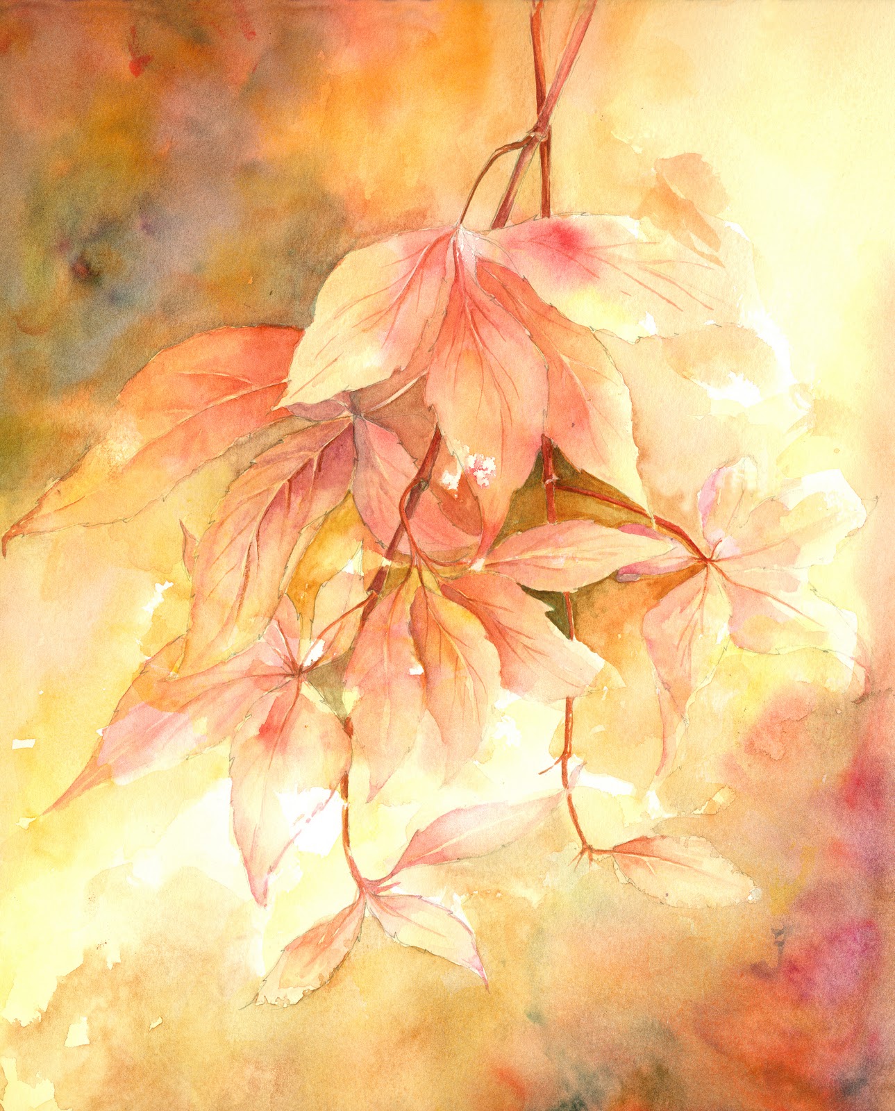
Autumn Glory

The view from my studio window is truly glorious at the moment. There are 2 silver birch trees wearing their autumn foliage, with the silver bark showing through the loose branches. When the sun shines through them, especially in the early morning and it is low in the sky, the colours are mouth-watering.
On Thursday morning, the sun was out around noon, and as I came away from Art Club, the bonnet of my car was up against a tall hedge of muti-coloured shrubs which give us lots of foliage choice throughout the year if we need something of that sort for the still life painting. This week, there were the most beautiful end twigs of what I think is Virginia creeper. I,m not very good on trees and shrubs, but the name is not really important,
What was inspiring, was the way the sun shone on these leaves which were buttery cream in place and a beautiful pinky orange or magenta in others, often on the same leaf. I could not resist. A discreet clip here and there and the minute I got home I had paper and paint on the go, so afraid that they would wilt and die before I had done my best to capture them in a painting.
Once the drawing was done, I flooded the paper with Naples yellow and a mixture of Naples yellow and Quinachridone Magenta, leaving bits of white and being careful to keep both colours separate in places to maintain the freshness of the colours. I then took a rubber to the drawing to remove any pencil lines which were in the unpainted ares to give me some lost edges. Finally, I had a great time painting the leaves, strengthening the colours where necessary, darkening the background behind the leaves, and finally adding more colour to the top left and bottom right, to leave a highlighted passage diagonally across the middle! Over the years we have painted so many autumn subjects, but there is always old favourites to try again, and new exciting ideas to develop. I hope you enjoy looking at the painting. I am pleased enough to mount and frame it.

                                                 Watercolour on Centenaire 'not' paper
                                                             300 gm  30cm x 40cm

In addition to the Naples Yellow and Quinachridone Magenta, I also included Quinachridone Rust, Brown Madder, Nickel Quinachridone, Cadmium Orange, and Indigo in the background.

Thursday, 27 October 2011

Fashions in Flowers

I am frequently struck by the way flowers seem to go in and out of fashion, but seemingly they do.When I think of the pattern of sales over the past few years, it seems to support this premise. I suspect that those flowers shown frequently in gardening programmes and those chosen as star performers at the great gardening shows are bound to have their moment of glory, but there are definite trends apart from this. A number of years ago, lavender was all the rage and I sold almost everything I painted , this was followed by opium poppies, then wild flowers like buttercups and dandelions, then we had the sunflower, then the hellebores, then Iris.I've had a bit of a run on foxgloves as well. Now, I am hoping that it is the turn of the agapanthus.
I am besotted by these beautiful stately flowers and I love their gorgeous blue colour, especially the deep blue ones. I have never painted nor sold many blue studies, so maybe the time has come!
I have tried endlessly to grow these in my garden (together with delphiniums) but they do not like the soil. and although, from time to time, I get plenty of leaves, I have only ever had one fairly pathetic bloom.
Against my better judgement, I have just acquired a large pot planted with two varieties. For the time being I have left them in the pot to over winter, so they can be more easily protected. I have painted the flowers from this pot 3 times recently as I cannot be sure if they will flower again next year. I am ever optimistic!At the last exhibition, I sold the only one I had previously painted, and regretted it as soon as it left the building, so I now have the dilemma, about which one to keep and which to put up for sale in the next exhibition. Isn't life hard!!

I hope you enjoy looking at the three paintings and would be interested to know which you would keep, if any!


 All three are painted on Fabriano Extra white 300 gm paper. I have as feeling that the 3rd one is suffering a bit of bad photography, and the colour rendering is not quite as good as it should be.

Tuesday, 18 October 2011

Having Fun

I have beeen browsing my copy of Ann Blockley's latest book....'Experimental Flowers In Watercolour' (published by Batsford) and thought it was time to have a bit of fun throwing paint at paper in a reasonably controlled way.
True to my expectations it was great fun and I will definitely have another go. I did a quick drawing of some Foxgloves so the I would  have a vaguely recognisable flower painting at the end of the session, and with plenty od water and paint I loosely put in the flowers. I sprayed them whilst wet which gave a bit of bleeding which was good, and then I really let go and splashed great amounts of fairly dark mixtures of paint around the flowers. I think the idea is to be very free but still in control!!
The resulting background, I though was fab and am looking forward to doing it again. I think maybe I should have spent a little more time in contemplation between the processes, but I was afraid to tighten up again if I didn't tackle it swiftly and uninhibitedly.
I used lots of indian ink, brown and white acrylic ink and plenty of Venetian Violet and Paynes Grey and Indigo.
Word of warning....wear a good large apron. My splashing went everywhere and I had to put my trousers pretty quickly into the wash as they were black and became covered in white and magenta speckles!!

 
The foxgloves do look quite controlled, but they are in fact quite loosely and quickly painted. This might be more obvious if you click on the image and enlarge it. Painted on Centenaire  300gm Rough paper, 12 X 16 ins.

Saturday, 15 October 2011

Making Something of nothing

The past two weeks at club, we have had subjects which didn't seem to offer very much scope. The first depended upon having an interesting garden at this time of year, which most of us are struggling with, and the second depended upon a shoe or pair of shoes. I am of that certain age when my shoes have to be more sensible than glamorous and hubby does not aspire to sartorial elegance either.
The first week, however proved less difficult as it was surprising what I could find either in the garden itself, or what I had saved and dried on the studio shelf, These I took with me and simply drew the objects, including rose hips, poppy heads, Chinese lanterns and bull rushes, intermingling on the page, and then had a go at painting them. By the end of the two hours I had a reasonable selection of 'pods and twigs' (the official title). Later at home I painted in the lower left background to help hold the composition down and to try to give a sense of it all growing excitingly together, and was quite pleased with the final result!

     
                                                   'Autumn'  watercolours on Centenaire
                                                   300gm rough watercolour paper

The second subject 'Shoes' left me with very few ideas about how to be imaginative with this title, and I have a lot of admiration for those members who managed to be very illustrative and tell some kind of story with their work. I, boringly, set about a very traditional still life using a pair of ankle boots that I found lurking at the back of the cupboard. Did I really ever buy, let alone wear white boots!!


                                         'New Boots'  Watercolour on Centenaire 300gm
                                         rough watercolour paper

Monday, 26 September 2011

Pen andWash

Thursday's subject a fortnight ago was 'drawing exercises' : any medium (but had to be dry), any subject and any style.Not my favourite subject as I profess to be quite weak at drawing, but I suppose this is all the more reason to practise!
In the spirit of 'making them all count' for the 2012 exhibition, I chose to draw in permanant pen, as I hoped that this would enable me to add some colour later, as black and white drawings do not seem to sell that well for me.

'Sunflowers and Pineapple'
Permanant pen on hot pressed paper

I was reasonably pleased with the result and included in my portfolio to take on holiday with me to finish if the weather wasn't too good.
True to form, it poured with rain all day Tuesday so I added the promised wash to the painting. I did find it difficult to move the paint around on the hot pressed paper and was disappointed that the finished result was heavy and over-worked. But there you go, win some, lose some.


As I had taken the trouble to carry the sunflowers all the way to Cornwall, it seemed a pity not to make the most of them, so I paid over the odds for a couple of lemons, and scoured the holiday cottage for a couple of jugs or vases and had a second go to see if I could get something a bit more to my taste from the flowers. This time tha paper was Fabriano extra white and the weather was a lot brighter and I think the results are a lot better. See what you think.


Monday, 12 September 2011

New Paper

Peter Ward was kind enough to give me a sheet of paper of the new product exclusive to Great Art. Its called Centenaire ( see one of his previous blogs) and is considerably cheaper than some of the more established manufacturers. One of the attractions for me is that it is very white compared to,say, Whatman.This is a must for me when I am doing my floral paintings, so I was quite interested to try it out.
At Club this week, the subject was 'Pots and Vases' and I used my sample sheet to produce the still life below.

The paper is 140lb not paper, I believe, and I found it fine to work on. The colours of the background bled well when painted wet on wet and the paint sat well on the paper for the objects. My only slight criticism, was that hard edges were difficult to soften once they had dried completely, and I did not like to scrub too hard as I was not sure if the paper would take this kind of abuse. It was just a question of keeping concentration long enough not to allow paint to dry until I was satisfied with the edges. Sometimes, at club, this can be difficult, as we all enjoy it as a social occasion as well as a painting session!

Also this week, I have had a go at a slightly different composition, putting detail at the top and having all the lost edges at the base of the painting. Usually I work the other way around. It came about because I saw a clever photograph of a bunch of flowers taken that way in a gardening magazine and thought it might be interesting to try out. Trying new things can sometimes be surprisingly enervating Not totally sure if the photo does the painting justice, but see what you think.


'Marguerites'  Watercolour on Fabriano Extra White
38cm x 28cm