Pages

Tuesday, 22 March 2016

A lesson for us all

Not my usual upbeat post today............I have been very upset and angry to find that I have been the subject of commercial theft.
I am writing about it on my blog site so that anyone who posts images on the internet can be aware of what can happen.

I had a lovely e mail from a student of embroidery to ask permission to use a couple of my paintings for projects within her course during which she was studying how to transpose paintings into embroidery projects. As an educationalist, I was happy to oblige, but pointed out that this could only happen whilst she was studying, and any work beyond that had to be approved by me and a fee payable.

This week I had a e mail from her to say that she had just started doing the drawing for her first piece when she found that a Russian company called RTO had already included it in their latest catalogue as a cross stitch kit. She was e mailing me to ask if there were any other paintings on which I had sold copyright, so that she could avoid using them.

I replied that I had certainly not sold any copyright to this company and in effect, they had stolen my painting and were using it commercially. It is a large company with a substantial catalogue so I presume that it is highly profitable.

This is my painting. You may well recognise it as it has appeared in one of my posts. I accept that by putting work on my posts and on my web site and talking as I do about the processes I use, other amateur artists will be encouraged to have a go.....its one of the ways we all learn. But they are not there for commercial gain.

This young lady then got in touch to tell me that there had been a recent trade exhibition in Cologne and this company had mounted a display of their forthcoming projects and on the wall in their display area was.........can you guess


As I am sure you can imagine I was incandescent with anger, at how a large and presumably prestigious company could stoop to commercial theft.
It has been difficult to do anything as everything to do with the company on the internet is in Russian so very difficult to understand, but I did manage to get the various links so that I could see my work in the catalogue and obtain the company address etc.
My young lady has sent me the links to their previous catalogues so that I was able to check that nothing else of mine has been used.

I have written  an e mail to the company stating very forcefully my thoughts on the matter and threatening them with international law, and asking for a substantial copyright fee.

I have no idea if I will hear back from them, or what my next step might be.
I suspect that they never thought that they would be caught, and it is the merest chance that I have found out about this, and I am so grateful to the young lady.

I will keep you all in touch with any progress, but please, where ever you are, if you see the catalogue or any of their products for sale, PLEASE do not purchase my design as they have no right to be selling it. And if you can spare the time let me know where you saw the embroidery kits.

On a much lighter note, the last two weeks at AVA group have produced 2 completely different paintings which I hope you enjoy seeing.

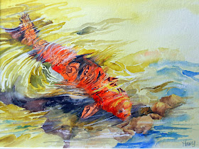
This painting was my response to the subject of Water. Totally outside of my comfort zone!


'Golden Carp'
 
Secondly, this week my response to 'Sunlight and Shadows'. Much more my kind of thing!

                                                                  
                                                                       'Blue Cactus'

Tuesday, 15 March 2016

Blackberries Again

Two weeks ago at Avon Valley Artists, the subject was Fruit and/or Vegetables. I prepared a sheet of paper and found a photo of a branch of blackberries, as this subject had proved very popular at the previous 2 exhibitions in Wells Cathedral.
Unfortunately I was unable to attend the session, but took the paper and paints with me to my alternative venue and was able to execute the subject.

I wanted to use both ways of painting the background....both before the subject and after it.......and was able to do this as the background and subject were planned to be very similar in colour to each other. There would, therefore be no conflict of painting one colour on top of another. So I could do the wash first, paint the fruit and then add the darker undertones.


I used a piece of 'Leonardo' paper, and wet the paper using a spray bottle. I dropped paint into the water and let them do their own thing. The only manipulation was the blowing of some of the paint at the bottom with a straw to create twiggy to enhance the way brambles grow.


I did very little drawing on the dried wash, and just painted the berries, developing the composition as I went along. It was great fun varying the colours in the hope of producing various degrees of ripeness!


When the berries were complete, I used my usual palette of darks to paint behind the berries at the top to hopefully give some depth to the painting.
I think it works reasonably well!

Wednesday, 2 March 2016

Californian Poppies

I came across a unsung photo of some lovely yellow and orange Californian Poppies which I thought might make an exciting painting.
The decision this time was to do the flowers first and the background later. Partly due, I think, to a disappointing painting of Foxgloves where I had tried to paint the flowers over a green and pale pink wash.
So I started with the usual drawing, having 3 large flowers in the middle of the picture, and some seed heads with them.
As I wanted the flowers to look as if they were part of a wider bunch. I also lightly pencilled in the under shapes of half a dozen more.


I painted the main flowers first using mostly Transluscent Orange and a variety of yellows. Working as I usually do by painting as close to the pencil line as possible and then erasing it when the paint is dry. In this instance, I did not try to mix a shadow colour, but simply used stronger pigment for the darker areas created by parts of the petals overlapping.  I used Serpentine Green, Sap Green and a little Yellow Ochre for the stems and seed heads.
At this stage I lightly suggested the background poppies with a very pale mix of the same colours used in the front flowers.
I then started in the middle of the painting with the darkest greens, mostly Apatite Green with some Indigo added and I also dropped in tiny amounts of the orange and Quinachridone Gold to link flowers and background together,


As I progressed with the background, I washed colour around the background poppies and strengthened their colour slightly in places, but was very careful to keep lots of soft and lost edges.
As usual the darkest parts were in the bottom LH corner and the lightest parts in the top RH corner.
As I painted the background in, I added granulating fluid to add interest and texture.


When the painting was complete, the hardest part was taking the photos and getting them to look as near the real colours as possible. My camera did not seem to like this combination of green and orange. Maybe I need to be a bit more imaginative with my camera settings. If anyone has any ideas, I would be grateful for a few tips.