Pages

Friday, 28 September 2012

Abstract at AVA

This must be the most difficult subjects that members have to tackle. Thinking outside the box is really hard to do if you are mainly a figurative painter.
Although I knew what the subject was to be, having taken part in the setting of the programme ( 4 large white cardboard boxes) I had no idea what I would do until I got there.
After a bit of thought, I decided that lovely combinations of colour would be good, and so used a series of angles, into which I added varios washes. At the time I thought that I was making the paint fairly strong, but at the end of the 2 hour session, I thought the whole thing was wishy-washy, and I did have problems coping with the lack of curves.
I had every intention of improving the painting when I got home, but I think I only made it worse.
Never mind, it would not do to have 100% success. A bit of abject failure is a good spur to trying harder!!


The painting was done on 'Cornwall' paper.


Wednesday, 26 September 2012

Pink Anemones

Terrible rain and plenty of wind sent me scurrying back indoors, after being hopeful that I could do a little tidying up in the garden. Before the rain got too heavy, I took the opportunity to pick a few flower heads from one of my favourite plants in the garden. I have this ever-increasing clump of pale pink double Anemone Japonica. It is a beautiful sight at this time of year, and it was just what I needed to wet my appetite for a spot of painting. I only cut 4 blooms as I had no intention of painting a figurative still life with vase etc. I just wanted a reminder of how they are formed and the colour range in the petals. I did put them in a small pot, but simply to keep them fresh whilst I did the initial drawing.


I decided to use the 'Leonardo' paper as this was to be, for me, quite a large painting. I cut a full sheet in half, giving me a sheet 56cm x38cm
I completed  the drawing, trying to get a variety of shapes and viewpoints, and included a couple of back views, hopefully to make the composition seem more natural. It was then just a question of painting the petals, trying to get depth and movement, and I used mainly Quinachridone Magenta with a little Opera Pink, to which I added a tiny amount of Quinachridone Purple if I needed some darker passages.


At this stage I was not sure how I was going to tackle the background, so I was careful to only paint right up to the pencil line and not over it. That way I was able to rub out the pencil once the paint was dry. This has the added advantage, where the paint has not gone right to the tips of the petals, deliberately leaving white paper for the highlights, the removal of the pencil lines gave me lost edged which I want to include in the painting.

This may be a good time to explain my trials and tribulations with 'Leonardo' paper. It was acquired, if you remember, to prevent buckling when using lots of water without having to stretch the paper.
When I first used it, I was so disappointed that I did consider giving it away as I thought I would never enjoy using it. However, with a little perseverance and a bit more pre-painting thought, I have managed to produce one or two reasonable paintings on it. (See Verbascum in 'As Different As Chalk And Cheese' and Blackberries in More Daniel Smith Colours' ). The following comments are only my thoughts and I am not claiming that there is anything technical wrong with the paper, and some wonderful artists use it all the time.

The paper is so thick it resembles blotting paper, hence :
1.It is very absorbent and takes quite a lot of wetting.
2.The paint tends to be instantly absorbed into the paper and is thus difficult to push around. It does not seem to have any surface which holds the paint until you have got it where you want it. This meant that I ended up with strong patches of paint, brush shaped which I could not dissipate.
3. Because of its absorbency, it takes much longer to dry. Having painted a petal, say, I waited for the surface to dry, before painting the adjacent petal, but after a few seconds, the water in the core of the paper made the two colours bleed into each other. You can see this in the stems of the Anemones. I will adapt them before mounting, but left them to illustrate my point.It does take ages to dry right through!
4. It does absorb lots of paint. With some of my colours at over £10 a shot, this can be a disadvantage.

Having said all that, it does stay flat, which is great, and I have been very pleased with the diffused effect, soft edges and muted colours which I have achieved on it.
I will keep using it, and you never know, I may be singing its praises before the end of the year!!

Back to the painting.


Having painted all the petals, it was time to make a decision about the background. I chose a mixture of all the colours in the petals and added Phalo Blue, Phalo Green and Cobalt Teal Blue in the main. Initially, I wet large areas of the background and dropped in some Quinachridone Magenta to give me some pale pink patches, and then when these were dry I re-wet the areas and dropped in other colours to produce dark and light passages. All that was left to do were the orange stamens, some  shadows on the left hand side of the blooms, a little white gouache on some of the petal edges and a bit of judicious splattering with the white gouache.


I am quite pleased with the finished result. It is quite a bit tighter than some of my recent paintings, but that's ok as it makes for a varied and interesting exhibition. I am especially pleased with the top left background!
Hope you have enjoyed looking.


Thursday, 20 September 2012

More Daniel Smith Colours

Having ordered the previously mentioned Quinachridone Purple and added to the order 4 other colours including Phthalo Blue and Phthalo Green (BS) from the SAA, I was pretty keen to try them out. I have been having a bit of a love affair with the deep purples and blues since the Fuchsia painting, so chose these colours for my painting at AVA this week. The subject this week was leaves and berries, so I had a trial run with some blackberries and then painted elderberries during the session.

In both cases I painted the background first, wetting areas of the paper with clean water , and then dropping paint into the wet areas. I made sure that I used enough paint to allow the colours to run down the page, but made sure I retained plenty of white areas. Where the paint did not move quite so well, I blew through a straw, sending the paint like twiggy branches across the sheet. Also in both cases, I used the same sorts of colours as I was going to use for the berries.

 .
In this case the background colours are Indigo, Ultramarine Blue and Quinachridone Magenta. Once the background was dry, I made a limited sketch where I thought the fruits and leaves should be, just to check that the composition would be ok, and then I had great fun painting the leaves and berries. I was careful to place both leaves and berries both over the background and on the white patches. Hopefully, this gives clear fresh colours in the foreground and more muted tones in the background.


In this painting, the process was exactly the same, but the background colours are Qinachridone purple, Phthalo Green and Phthalo Blue, and the berries are combinations of the same colours with plenty of Opera Rose, especially in the foreground fruits.

This large bush grows in my neighbour's front garden and is called I believe 'Sambuca Negro' It has the most beautiful delicate pink flowers on it before the fruits start to appear. As there were flowers as well as fruits this morning, I included a couple of flower heads in the top LH corner. I used salt to create the shapes and when this was removed, I painted the lighter side with tiny spots of Opera Pink and white acrylic gouache.

The only part of the painting that I am not pleased with, are the stems which will have to be altered as they look odd, appearing to have flowers one end and fruit the other, but I am sure that will be easily rectified.

I am sure there will be more Quinachridone Purple things appearing in this space!!

The blackberries were painted on the heavy weight 'Leonardo' and I must admit to getting more used to it and it may not be as awful as I first thought. ( How can it be awful when so many lovely painters use it all the time!!!)

The Elderberries was painted on Fabriano Artistico Extra white.
Both paintings measure approx 33 x 23 cms

Hope you have enjoyed looking.

Tuesday, 18 September 2012

Quinachridone Purple

At Avon Valley Artists last week, Peter was kind enough to give me a sample of Daniel Smith's Qinachridone Purple. I am no expert on paint composition, but Peter said that this is the first purple with a single pigment, and not made up of a red and a blue pigment. The assumption is, therefore, that it will be fresher and cleaner than previous productions. I promised I would give it a go to see whether I liked it or not.

I deliberately chose a flower with a deep purple skirt, to test its potential, but must admit that painting Fuchsias has never been very successful with me. Not sure I have cracked it this time, but at least I tested the paint.


I reverted back to the 'Fabriano Artistico' paper as I did not want the problems that I have been having with the 'Leonardo' to cloud my judgement.


I used a mixture of Quinachridone Purple and Opera Pink (both by Daniel Smith) for the majority of the flower painting. I had thought that the purple would veer more to the blue than the magenta, but I am not sure why I should have had that preconceived idea, and it certainly did not detract from the quality of the paint. It did mean, however, that in the very dark spots under the purple petals, I did add a bit of dark blue to give the darkest shadows.

I had enough paint from Peter to do the top two flowers and then I had to attempt to mix my own equivalent to finish the third , lower flower. In the original painting, the difference is quite obvious and this final flower is heavier than the other two.

I think it is a lovely colour for a flower painter and am definitely having some of that. I have ordered it from SAA as Jackson's do not yet have it on their list. I am hopefully painting Elderberries at AVA next week and I hope it will have arrived by then.

I am sure there will be more technical information available from Peter when he does his critique of the colour, and if you are interested keep an eye on his blog as I am sure it will be soon, after he has had the chance to use it. He can be found at www.watercolourfanatic.blogspot.co.uk

Thursday, 13 September 2012

Transport

I am not having too good a week at the moment. I started a large-ish painting using the Leonardo paper I have just bought, and although lots of successful artists use it all the time, I actually hate it. I have not got on with it at all, and the painting of sunflowers is sitting looking at me reproachfully in the studio, because I do need to finish it to see if I can get it back to anything half decent. More of that in another post when it is finished, and I will talk about why I find the paper so difficult to work on.

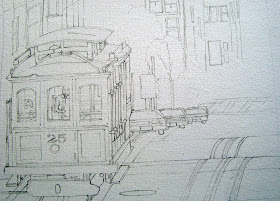
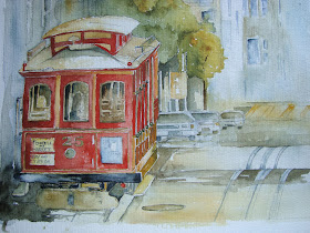
Then, the topic at Art today was 'Transport'. Not my thing at all, and I know the subject should not matter......all images are just a series of shapes and we should be able to treat them all in the same way. But I felt like a foreigner in a strange country, not speaking the language.....I just did not know what to do.

In the end I did enjoy the session, because I spent ages prior to the session doing as good a drawing as I could, so at least I had that under my belt.


 Not one to make things easy for myself, it was a bit complex but at least I thought it an interesting subject!


  Glad I tackled the drawing before the group meeting, it took me simply ages to get right.


The finished painting. It looks a bit pale here, think that might be the photo. I used 'Cornwall' paper which has quite a nice regular texture for this type of subject.


Saturday, 8 September 2012

As Different As Chalk And Cheese


                                               'Verbascum' Watercolour on Leonardo paper
                                                                    35cm x 25cm

Its been a week of contrasts this week. I have gradually been easing myself back into flower painting, hence the two previous posts (and a promised Agapanthus yet to come). I am still trying out the Leonardo paper and trying to keep everything as loose as possible so attempted to paint a lovely dusky yellow Verbascum that I came across in my gardening magazine. Its not a plant that likes heavy clay soil, so I have never produced anything to photograph myself, so have to rely on photos I come across which I can use as inspiration, and to check the actual shape of the plant. I do try to make my version of the flowers as different from the photo as possible and put as much of my interpretation in as I feel appropriate. Not sure it is by any means one of my best, but its worth a mount and maybe a place in the browser at the next exhibition.

This week was also the return of the formal programme at our Art group, and the opening subject was 'Summer Holiday'. Due to a situation beyond my control, I have not been away this year, except for a long weekend, when it poured with rain all the time, so I looked for something that reminds me of the holidays I have taken, often on the blowy East coast of this country.

I came across a photo of a beach scene with a row of empty deckchairs among other things and thought the shape of a deckchair had quite a lot of appeal. From a painting point of view, the finished work is nothing special, but my method of producing the picture might interest some of you.


I had no desire to draw each individual chair, I'm hopeless at things like this! So I spent ages drawing one chair as accurately as possible on an old piece of watercolour paper, making the drawing the size I wanted the chairs to be in the finished painting. Using a craft knife, I carefully cut around the drawing to produce a stencil of the chair. I did this before setting out as it did take me a while.

I started the painting by painting in the sky, sea and sand fairly loosely, just to give a bit of recession to the painting, and let it dry thoroughly.
I then carefully painted the struts of the deckchair stencil with a fairly copious amount of a warm sepia and yellow ochre mix, ( making sure the paint was applied to the side which would face down when used!) and whilst it was still wet, turned it over and printed it onto the background. Being careful to make sure each chair was reasonably dry each time, I repeated the process three more times across the page.
When they were all dry, I pencilled in the striped canvases and painted them, before touching up the wooden struts with darker paint, and some pen marks. I added a bit of splatter for the sand, some guessed shadows and a bit of white across the backs of the chairs to add form to them.

For many, it would be easier just to draw all the chairs, but I did want them all to be the same and this was  a fun way of doing that.

As a final note, I had all sorts of trouble making sure that the struts were painted going under and over the correct bits of wood, and had to alter several, which is why bits of the chairs look a bit heavy!!!

Couldn't have produced two such different paintings if I had tried. Hope you enjoy looking.


Tuesday, 4 September 2012

Roses

Now that I have had time to think back on the exhibition and to look at what sold, I was surprised to note that for the first time, I did not sell a single painting of Roses. I have noticed that flowers, like everything, else go in cycles and what is popular for a couple of years seems out of favour the following year, so perhaps it is the turn of the rose to be given a back seat.
At the moment , however, I have a passion for buying roses and I do have quite a few now.Two things prompted me to paint these roses. Firstly I was asked if I would like to hang some of my paintings in one of the luxury holiday apartments in the grounds of Rosemoor Gardens in Devon. Whilst I was there delivering the paintings, I saw a lovely rose in one of the beds, and when I got as far as the shop, I bought one. Its a rose by David Austin called' Morning Mist' There was not one in flower at the time so I have had to wait until now for the second showing to appear, which it has done over the last two weeks. Secondly, I watched a video about some of Daniel Smith's watercolour paints, and loved the colours produced when Quinachridone Coral  was mixed with the yellows, especially Hansa Yellow. I got my hands on the Coral colour at the last group ordering and have been waiting for an opportunity to use it. I thought the new paints and the new rose might go well together.


                                            'Morning Mist' Rose by David Austin

There is nothing special about the process for this painting, except that I am still using the 600gm paper, but primarily because I think I ought to use it seeing as I bought it!


The flowers are painted using combinations of Hansa Yellow, Opera Pink, Pyrol Red and Quinachridone Coral, all by Daniel Smith.


The background was painted with my favourite combination of Indigo and either Quinachridone Rust or Quinachridone Nickel Gold, all by M Graham. The leaves and bud are mixtures of Apatite Green ( Daniel Smith ) and various yellows.


In an attempt to get a few softer edges in the bottom corners, when I had painted in the greens, I lightly sprayed the paper with a little granulation fluid. As it was in a spray bottle, some of the spray hit the petals and the greens bled into them. A really light touch is needed with the spray as it can disperse over a wide area, and the paint bleeds into whatever is wet.

The photo is a little pinker than the painting, and the central flower seems a bit pale in this photo but its near enough to give you some idea of what it looks like.
The painting is 37cm x 27cm on Hahnemuhle Leonardo Matt 600gm paper